Research from Stanford University reveals that 75% of people judge a company’s credibility based on their website design alone. This demonstrates the critical role of design in shaping how people perceive your brand.
But a professional, well-designed site goes beyond visual appeal — it provides an accommodating space for all visitors, including people with disabilities.
The good news is you don’t have to sacrifice aesthetics for accessibility. With careful planning and design, you can make a website that is both visually pleasing and usable for everyone. Here at accessiBe, we want to make sure you can do just that.
In this blog, we’ll show you twenty stunning websites that stand out in accessibility. We’ll look at the important elements that make a site easy for everyone to use and show why making your website accessible is smart — beyond meeting legal requirements.
The top 20 most beautiful accessible websites
We’re excited to present a curated list of 20 websites that blend aesthetic appeal with web accessibility. These examples prove that creativity and accessibility can coexist beautifully, allowing brands to be both innovative and inclusive.
Each website on this list has passed accessScan, and conforms to WCAG 2.1 Level AA. This means they’re not just nice to look at for some while excluding others. These websites can be fully enjoyed by everyone, regardless of ability.
1. Peanut Butter & Co.
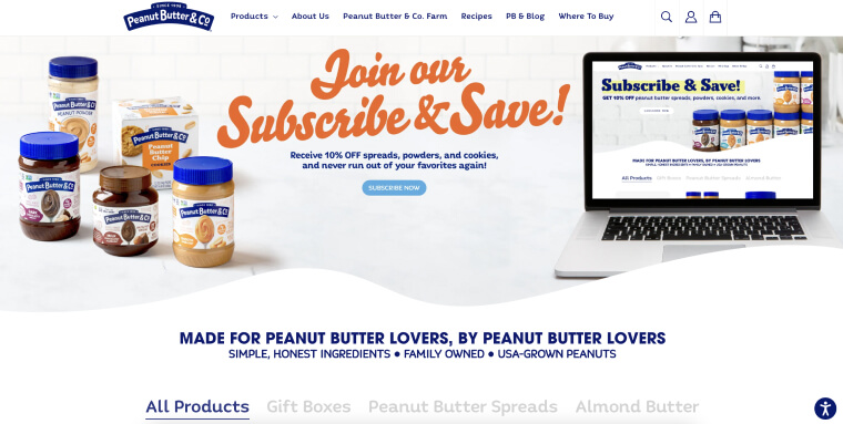
Peanut Butter & Co. brings a delightful twist to everyone’s favorite spread, peanut butter. Offering a variety of flavors from Old Fashion Crunchy to Cinnamon Swirl, they invite you to explore their world of gourmet peanut butter (and related products).
The website stands out for its effective use of color scheme and contrast. Warm, inviting colors capture the brand’s essence of being family-owned. Additionally, the site ensures easy readability of text against background. This makes the website not only aesthetically pleasing but also accessible to a wide range of visitors.
2. Clearstem
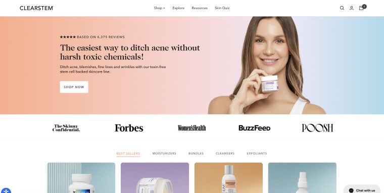
A prominent health and skincare company, Clearstem offers a variety of products aimed at alleviating acne, that are free of harsh, toxic chemicals.
What really sets this site apart in terms of accessibility is its highly contrasting color scheme. With shades of white and light pink, the black text really pops, allowing for optimal readability.
3. 2Gether-International
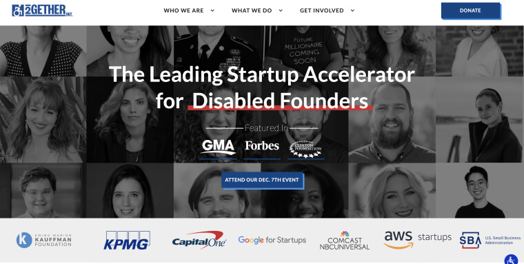
Challenging the traditional entrepreneurial landscape, 2Gether-International empowers founders with disabilities by connecting them with essential resources. Recognizing that they’ve historically been underserved in entrepreneurship, 2GI strives to flip the narrative — viewing disability as a competitive advantage in business.
2GI’s website design is as impactful as their mission. It combines a beautiful aesthetic with functionality, demonstrating the organization’s commitment to inclusivity. The welcoming and professional layout ensures all visitors can engage with and appreciate their message of empowerment.
4. Sweetkick
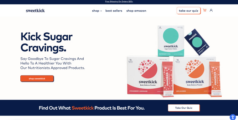
In their own words: “We created Sweetkick, products designed to help you manage and satisfy sugar cravings and support a healthier lifestyle.”
This online store scores high when it comes to menus, an prickly area when it comes to accessibility. Menus (including drop-down ones) are properly tagged for assistive technology, allowing for optimal navigation for those relying screen readers.
5. AdCentral
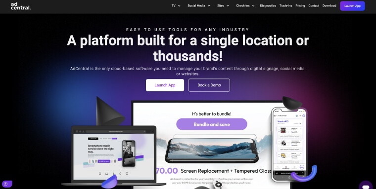
AdCentral is a one-stop digital solution for businesses across various industries. Whether it’s boosting a retail location’s online presence, automating social media for a landscaping firm, or crafting a professional website for an auto repair shop, their platform adapts to a multitude of needs.
The website captivates with its cool gradient, seamlessly blending black, dark blue, and purple hues. This background, combined with crisp white text, ensures strong contrast and readability.
6. Laservue Eye Center
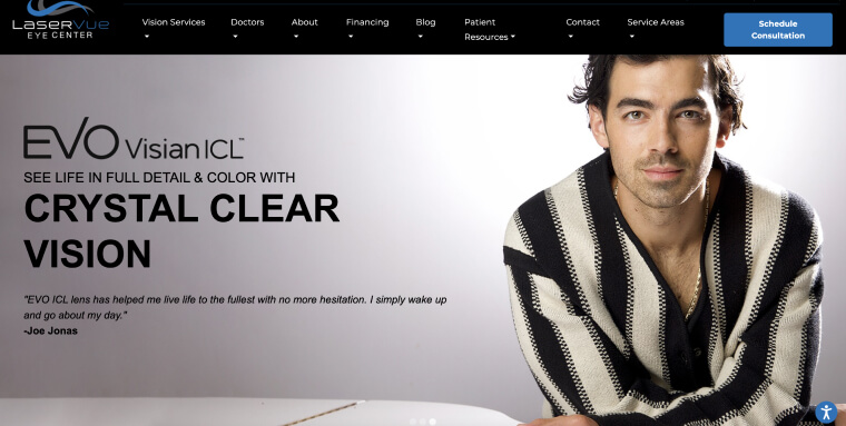
Discover the world of advanced eye care at Laservue Eye Center, where cutting-edge technology meets patient-centered service. Laservue makes comprehensive information on laser vision correction and eye care solutions readily available.
The standout feature of their website is its highly readable copy. The text is clear and concise, making complex medical information accessible to everyone. This readability allows visitors to easily find and understand the information they need without eye strain or confusion.
7. Constant
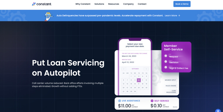
Founded by Catherine York Powers, Constant is reshaping how teams approach loan servicing and collections. Their innovative SaaS platform shifts contact volume to self-service channels. This allows financial institutions to maximize profit margins by reducing operational costs.
What sets Constant’s website apart is its customer-centric design. It’s simple to use and fully accessible for users from various backgrounds. The site’s interface is clean and intuitive, making navigation straightforward and efficient.
8. Commonwealth Insurance
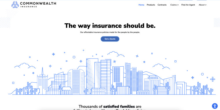
Commonwealth Insurance streamlines the insurance experience by offering clear, direct coverage options. Catering to a wide range of insurance needs, their approach simplifies the process of finding and managing insurance policies.
The website mirrors their offering with a very simple, yet stimulating, design. Free of distracting elements, it presents what the business offers in a highly accessible way. This clean approach ensures that information is easily found and understood — setting a new benchmark for web accessibility in the insurance industry.
9. Match Stoneware

Transforming the everyday dining experience, Match Stoneware showcases a unique collection of handcrafted ceramics. Website visitors can explore tableware that marries functionality with artistic design — perfect for any meal setting.
Match Stoneware’s website features excellent use of white text on a black background. Again, this lends to ample contrast, improving readability. Using Squarespace for their site, the handmade ceramics brand shows how thoughtful design contributes to accessibility. You can read more about Squarespace website accessibility by pressing here.
10. Blue Bowl
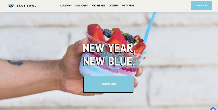
Blue Bowl redefines the concept of healthy eating with its delightful array of superfood bowls. They offer nourishing, flavorful options — inviting people to explore and try their favorite blends.
The site’s charm is largely in its font choice — Karla and Karla Bold. These fonts strike a balance between cool and legible, making browsing enjoyable and easy on the eyes for all visitors.
11. Michael Kohn Gallery
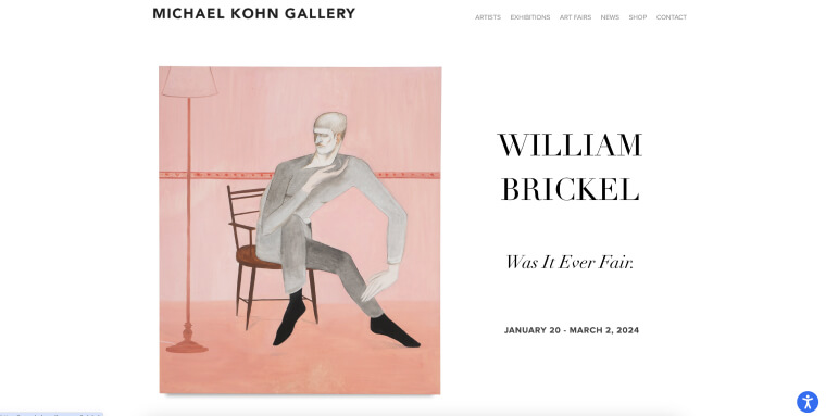
Michael Kohn Gallery is a distinguished art gallery in Los Angeles showcasing diverse artists, exhibitions, and art fairs. Known for its curated selection of contemporary art, the gallery provides a platform for artistic expression and engagement.
The gallery’s website reflects its commitment to elegance and accessibility in the art world. Embracing minimalism, the site reminds us that simplicity can be both sophisticated and user-friendly. The clean design and easy navigation make exploring contemporary art online an accessible experience for all art enthusiasts.
12. Gallica
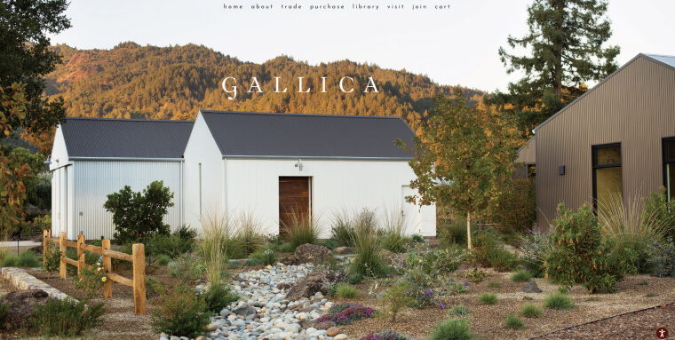
Immersing visitors in the world of fine wines, Gallica celebrates the artistry of winemaking. It invites enthusiasts and connoisseurs to explore its exquisite vineyards virtually or book a wine tasting session.
The site’s true highlight is its beautiful imagery. Each photo tells a compelling story of the care and passion that goes into Gallica’s wines. This visual storytelling not only captures the essence of their offerings but also makes the browsing experience alluring for all visitors.
13. Vuzix
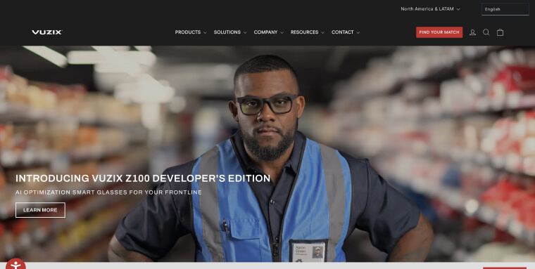
An industry leader in Augmented Reality (AR), Vuzix specializes in pioneering optical products that provide comfort and performance for defense, security, and enterprise professionals. Their smart glasses offer advanced solutions, pushing the boundaries of what’s possible in AR technology.
Their red, black, and white color scheme creates a visual impact that mirrors the cutting-edge nature of their products. This bold color combination ensures clear navigation and conveys a sense of high-tech sophistication. As a Shopify-built site, Vuzix also shows how eCommerce sites can be both striking and accessible. You can read more about Shopify website accessibility by pressing here.
14. Hickies
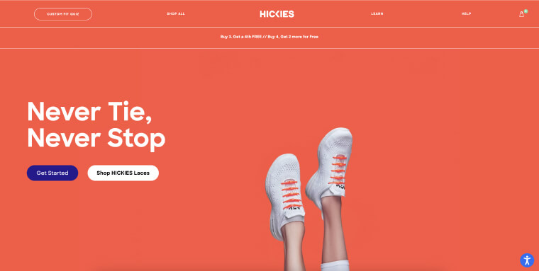
Hickies brings a fresh and innovative approach to footwear with its unique no-tie shoelaces. Their product range appeals to those wanting to add convenience and style to their shoes.
The website impresses with its cool color schemes, which are both eye-catching and harmonious. Coupled with a readable font, the site offers an accessible, fun browsing experience for everyone.
15. Som Sleep
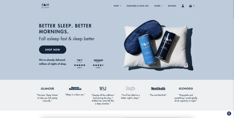
Som Sleep is all about helping people get better sleep with their functional berry-flavored sleep drinks. They serve those seeking a drug-free way to sleep well with a proprietary blend of magnesium, vitamin B6, L-theanine, GABA, and melatonin.
The website’s design echoes the calm and restfulness of a good night’s sleep. It features a cool color scheme with white and two soothing shades of blue. Additionally, the site has legible, well-spaced fonts, making it easy for anyone to explore their sleep-enhancing options.
16. Windmill
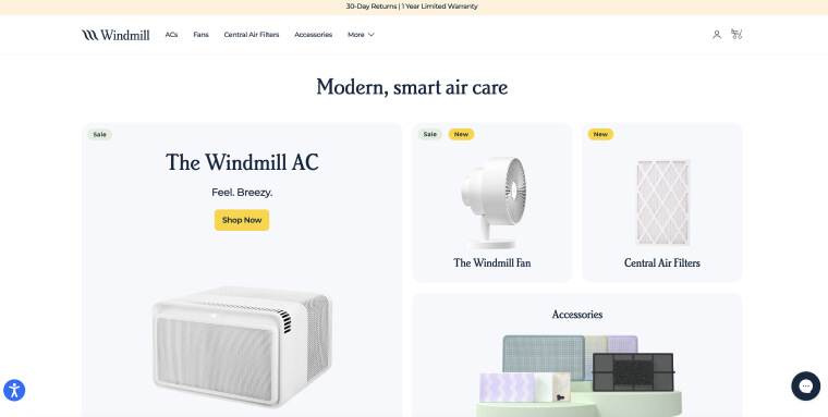
Once you land on this site, you know exactly what’s in store for you (the company name kind of gives it away, as well). Straight and to-the point, Windmill’s site presents a variety of ventilation products, like portable AC units and fans. The choice of dark blue font, appearing on a white background, is accessibility best practice, and is pulled off very elegantly on this online store.
17. Whispering Willow
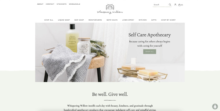
Whispering Willow brings a touch of serenity to daily self-care with its natural and handcrafted personal care products. Embracing simplicity and purity, they offer a range of items to soothe the mind and body.
The elegance of Whispering Willow extends to its website — where a minimal design enhances both beauty and accessibility. Clean lines, a muted and earthy color palette, and an uncluttered layout make it a breeze for anyone to shop and use the site.
18. Color More Lines
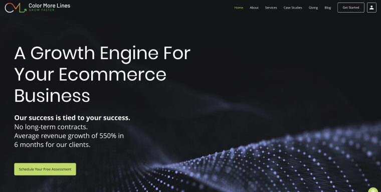
Color More Lines distinguishes itself in the eCommerce sector by offering quantifiable solutions to expand online businesses. Their approach, focusing on significant revenue growth without long-term contracts, has driven impressive results for their clients.
The website employs a best practice in accessible web design — a dark background with contrasting white font. This design choice not only provides a sleek and professional look but also ensures optimal readability. Leveraging the Wix platform, the site exemplifies how accessibility and aesthetic appeal can coexist seamlessly. You can read more about optimizing accessibility on Wix websites by pressing here.
19. Koeze
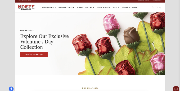
Established in 1910, Koeze offers a variety of gourmet nuts and popcorn, fine chocolates, and peanut butter. Their commitment to quality and tradition is evident in every product, offering a premium taste experience for discerning palates.
Website visitors are greeted with a clean and elegant layout, making it easy and fun to browse and shop for scrumptious treats. Built on the Magento platform, the site is a prime example of how eCommerce can be both luxurious and accessible. You can read more about making Magento websites accessible by pressing here.
20. AdventHealth University
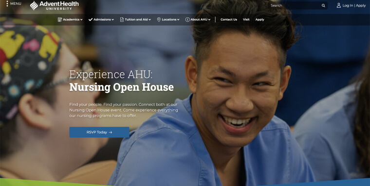
At AdventHealth University, education is about nurturing the next generation of nursing professionals. With a commitment to excellence, AHU offers a diverse range of degrees and certificates, dedicated to advancing skills in the medical field and promoting compassionate care.
AHU’s site excels in using great imagery and contrast, bringing to life the university’s dynamic community and advanced facilities. This visual appeal is complemented by the site’s accessible design, built on Drupal. You can read more about making Drupal websites accessible by pressing here.
What makes a website accessible?
An accessible website conforms to the Web Content Accessibility Guidelines (WCAG). Developed by the World Wide Web Consortium (W3C), these guidelines are the benchmark for creating web content that is accessible to people with disabilities. WCAG also plays a major role in multiple web accessibility laws; either being the official standard for compliance (like in the case of the Accessibility for Ontarians with Disabilities Act and Section 508 of the Rehabilitation Act), or being referred to as the optimal level of web accessibility conformance (like in the case of the Americans with Disabilities Act).
WCAG is built upon four guiding principles:
- Perceivable: Website visitors should be able to perceive website content and information through various senses
- Operable: Website visitors need to be able to operate your website regardless of ability. Visitors should be able to navigate the site using different methods like a keyboard or assistive technologies, regardless of their physical condition
- Understandable: Website visitors should be able to easily understand content and instructions without confusion
- Robust: For your website to be robust, it needs to use HTML and CSS according to specification, and be compatible with assistive technologies and devices like screen readers
WCAG has evolved, with WCAG 2.0 introduced in 2008 and its update, WCAG 2.1, having been released in 2018. The latest version, WCAG 2.2, was published in October 2023.
All three WCAG versions have three conformance levels:
- Level A (minimum)
- Level AA (standard)
- Level AAA (optimal)
Conforming to WCAG 2.2 Level AA is generally the standard for ensuring a website is accessible.
This involves practices like making text readable and understandable, providing descriptive alternative text for meaningful images, and ensuring compatibility with assistive technologies.
Click here for a detailed checklist on how to achieve WCAG conformance.
How to test your website for accessibility
To test your website for accessibility, you can use automated tools like accessScan and/or lean on expert service providers such as accessServices.
With accessScan, all you have to do is enter your website’s URL. Then, the tool conducts an automated audit against WCAG 2.1 Level AA standards. You’ll receive a score indicating your site’s compliance level — accessible or non-compliant. Additionally, you’ll get a detailed report pinpointing specific areas needing remediation.
For a more comprehensive evaluation, accessServices provides manual audits and remediation services. Many businesses find value in these detailed inspections. They like the peace of mind of knowing their websites meet accessibility standards beyond automated checks.
Note: Combining both methods is often the best approach. Automated tools like accessScan give a quick initial audit, while services like accessServices provide in-depth analysis and remediation for any issues discovered. This two-pronged strategy helps create a website that’s truly accessible to everyone.
Closing thoughts
Making your website accessible to everyone, including people with disabilities, is an excellent step toward inclusivity. Accessible web design results in sites that are intuitive, engaging, and visually appealing — benefiting all users.
As you can see from the examples we’ve covered, incorporating accessibility best practices can lead to sleek, readable, and stimulating websites that elevate the user experience. By prioritizing accessibility, you broaden your audience, improve customer satisfaction, and contribute to an equitable digital space. In the end, an accessible website represents your commitment to serving and valuing all your visitors.
Frequently asked questions about accessible websites
Q1. What makes a website accessible?
A1. An accessible website is designed so people with disabilities can navigate, understand, and interact with it without barriers. This includes support for screen readers, keyboard navigation, clear structure, readable content, and predictable interactions, following the principles outlined in WCAG.
Q2. Do accessible websites need to follow WCAG guidelines?
A2. While WCAG is not a law, it is the most widely recognized set of guidelines for creating accessible digital experiences. Many organizations use WCAG to help align their websites with the accessibility expectations associated with the ADA and other global standards.
Q3. Does an accessible website also help with ADA compliance?
A3. Improving accessibility helps support ADA compliance efforts, although no single action guarantees full compliance. The ADA is the law businesses must follow, and WCAG provides the guidance organizations typically use to understand how to create accessible web experiences.
Q4. Why are accessible websites important for businesses?
A4. Accessible websites welcome a wider range of visitors, offer smoother user experiences, and help demonstrate a genuine commitment to inclusion. Better accessibility often leads to stronger engagement, improved reputation, and more consistent interactions for all users.
Q5. What are common accessibility features found on well-designed websites?
A5. Accessible websites often include clear headings, sufficient color contrast, meaningful alt text, labeled form fields, keyboard-friendly navigation, and content that is easy to understand. These features support users with disabilities and improve usability for everyone.
Q6. Does mobile accessibility matter as much as desktop accessibility?
A6. Yes. Many users browse the web primarily on mobile devices, so accessible design must work across screen sizes, browsers, and operating systems. Ensuring both desktop and mobile accessibility helps maintain a consistent and inclusive experience.
Q7. How can organizations check whether their website is accessible?
A7. Organizations typically use automated testing, manual evaluation, and assistive technology testing to identify accessibility barriers. Tools such as accessScan help provide quick WCAG-aligned insights, while accessFlow offers deeper auditing, monitoring, and remediation support for developers.
Q8. Do accessible websites need to consider PDF and document accessibility as well?
A8. Yes. Many digital experiences rely on PDFs, forms, and downloadable files, which must also be accessible. Accessible documents include proper tagging, reading order, alt text, and structure that allows assistive technologies to interpret them correctly.
Q9. Are accessibility improvements a one-time project?
A9. No. Accessibility requires ongoing attention. Content updates, new pages, design changes, and platform updates can introduce new barriers. Regular testing and proactive maintenance support a long-term accessible experience.
Q10. How can accessiBe help organizations create and maintain accessible websites?
A10. accessiBe offers end-to-end accessibility solutions that combine advanced AI, human expertise, and developer tools. Solutions like accessWidget, accessFlow, and professional remediation services help organizations identify issues, improve accessibility, and support efforts toward meeting ADA expectactions in adherence to WCAG.
