Most digital interfaces are loud. They are filled with auto-playing videos, high-contrast patterns, and unpredictable animations that compete for a user’s attention.
While a neurotypical user might find this “engaging,” for the 20% of the population that is neurodivergent, these same elements can be physically exhausting or even painful.
Designing for the neuro-minority—including those with autism, dyslexia, or Sensory Processing Disorder (SPD)—requires treating sensory ergonomics as a foundational design principle rather than a series of technical patches.
But what does that entail exactly? What will you need to do to move from theoretical compliance to an environment that respects the real spectrum of human cognition?
In this blog, we explore advanced design patterns that support the neuro-minority. You will learn how to optimize digital environments for the full spectrum of sensory and cognitive needs.
Understanding how people with neurodivergency experience the web
To design effective tools, it is necessary to understand how the digital world feels to someone whose brain processes sensory input differently. For many in the neuro-minority, a standard website isn’t just “busy”—it can be a source of physical distress or mental exhaustion. This friction usually shows up in three main ways:
Screens can be too “loud”
Most websites are designed to grab attention. They use bright colors, moving banners, and pop-up alerts to keep users engaged. While a typical brain can usually filter out this background noise, many neurodivergent people cannot. This leads to sensory overload, where the brain becomes overwhelmed by too much information at once. When this happens, a user may feel anxious or need to leave the site immediately to find relief.
Confusion from “hidden” meanings
Many apps use symbols or “clever” design instead of clear words. For example, using a “hamburger” icon (three lines) for a menu or a “gear” icon for settings requires the user to guess what an image does. For people who think literally, these symbols can be confusing. If the path to a goal isn’t direct and predictable, it makes using the app feel frustrating and uncertain.
Feeling stuck or overwhelmed
For users with ADHD or challenges with planning tasks, a long, complicated form can lead to a “freeze” response. When there is too much to process, the brain struggles to decide where to start. This isn’t about a lack of effort; it is a mismatch between the design and how the user’s brain works. Every extra choice or bright flash “costs” energy, leading to burnout much faster.
Eight practical tips for neuro-inclusive design
Designing for the neuro-minority—including those with autism, dyslexia, or Sensory Processing Disorder (SPD)—requires building your digital environment with sensory needs in mind from the start.
Here are eight actionable design tips to help you optimize your digital environment for the full spectrum of sensory and cognitive needs:
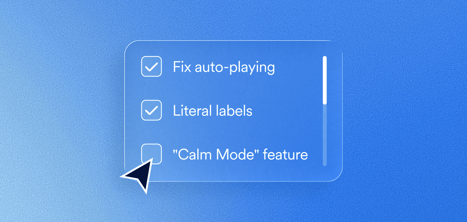
1. Eliminate all auto-playing media
Unexpected sound or movement can be physically distressing for users with sensory sensitivities. Ensure that all videos and audio files are set to “off” by default.
By requiring a manual click to play, you give the user full control over their environment and prevent the anxiety that comes from sudden, loud interruptions.
2. Provide a “Reduce Motion” toggle
Animations like parallax scrolling or flashing banners can cause dizziness or loss of focus for many users.
Beyond respecting the “prefers-reduced-motion” browser setting, include a visible toggle on your site that stops all non-essential movement.
This allows users to engage with your content without the interference of distracting visual noise.
3. Avoid pure black text on white backgrounds
High contrast is necessary for accessibility, but “pure” contrast (#000 on #FFF) can cause a vibrating effect known as halation, which makes text difficult to read. Use a dark charcoal for your text and a slightly off-white or very light grey for your background. This maintains contrast ratios that adhere to the Web Content Accessibility Guidelines (WCAG) – the guiding document for ADA and EAA compliance, while reducing eye strain and cognitive fatigue.
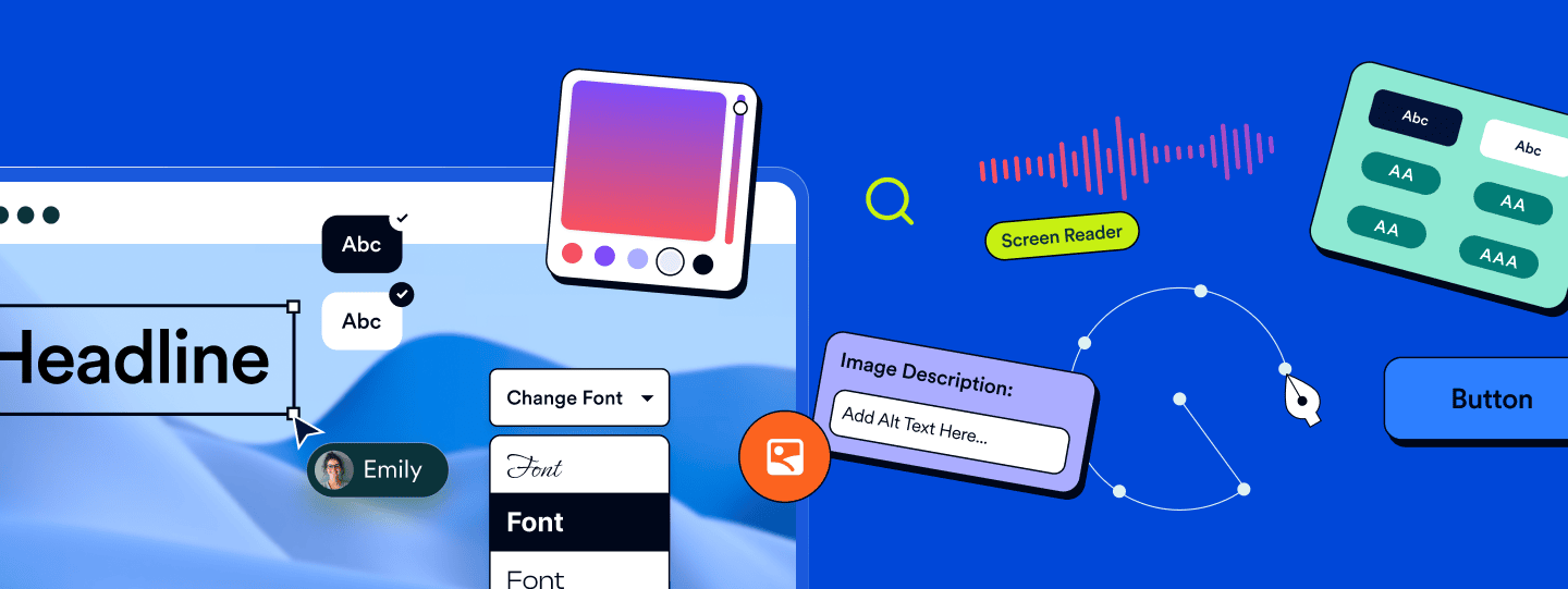
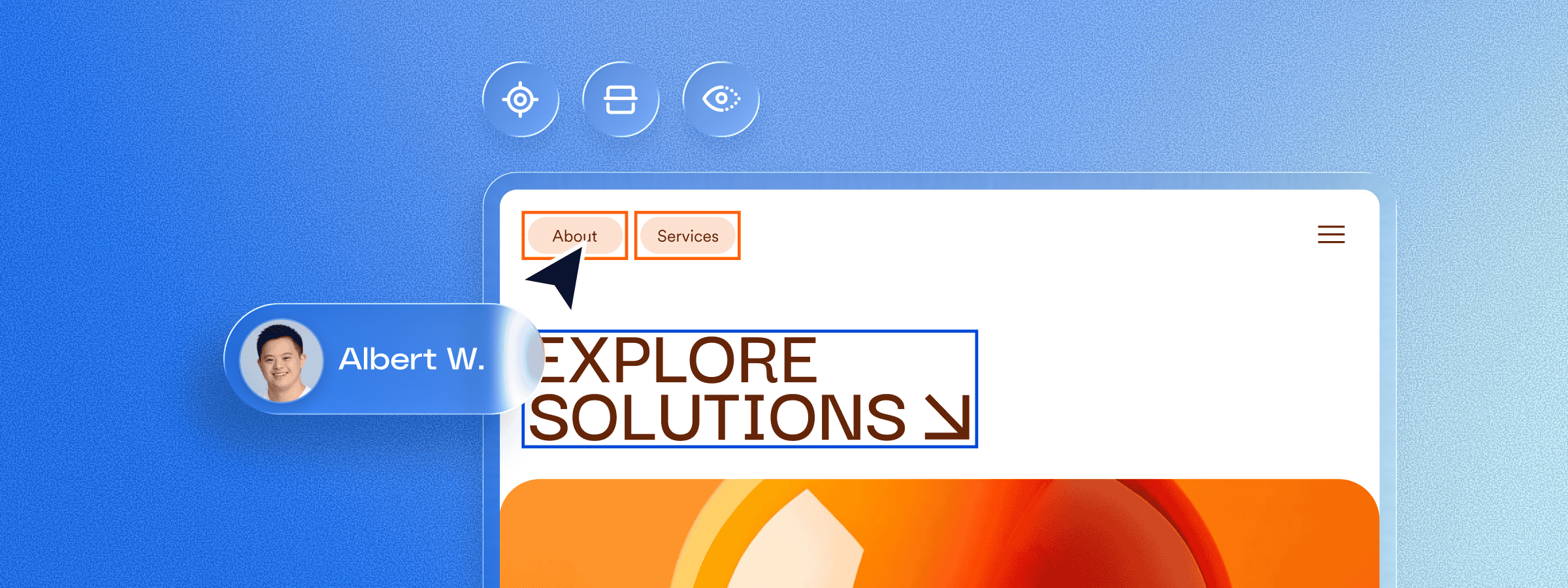
4. Use literal labels for all icons
Symbols like the “hamburger” menu or a “gear” icon for settings can be ambiguous for literal thinkers. Always include a text label alongside or inside your icons.
Clear labels remove the guesswork, making your navigation predictable and reducing the mental energy required to move through your site.
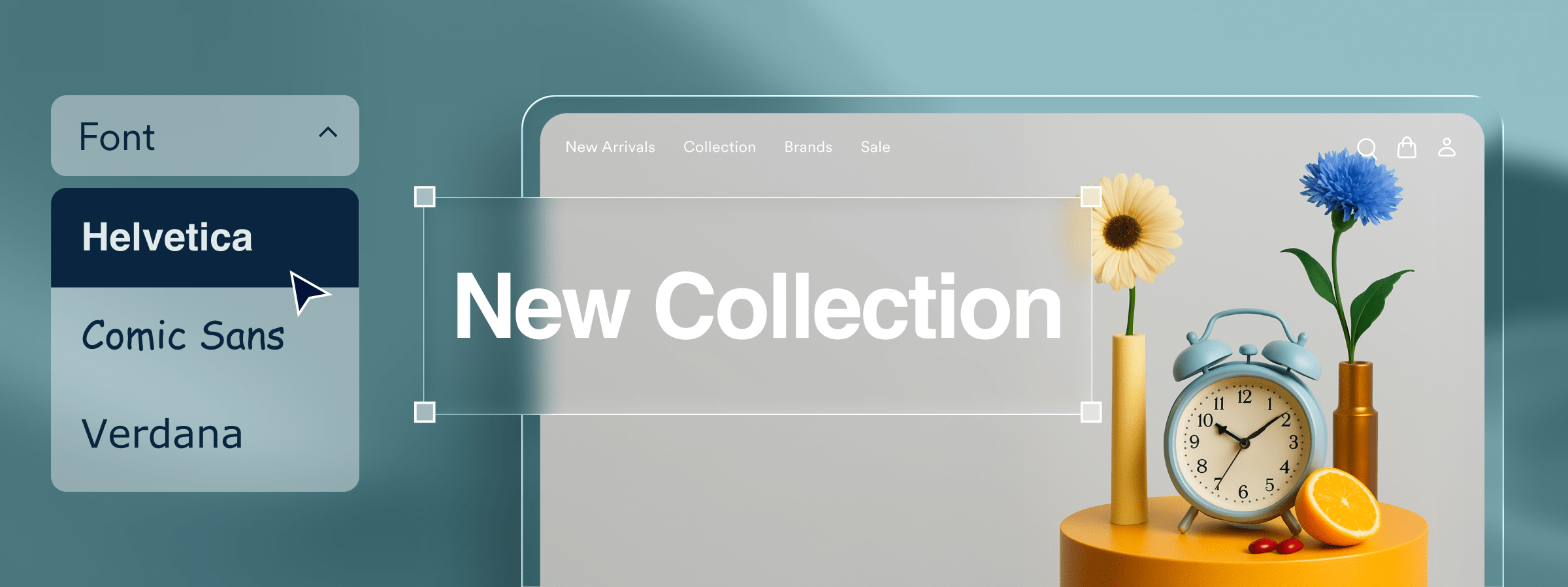
5. Standardize your typography for readability
How you present text is just as important as what you write.
Use familiar sans-serif fonts and set your line height to at least 1.5. Additionally, keep your text blocks to a maximum width of about 80 characters.
These small adjustments make it significantly easier for the brain to track from the end of one line to the beginning of the next.
6. Implement a “Calm Mode” feature
A “Calm Mode” or “Focus Mode” is a single setting that simplifies the interface by hiding non-essential sidebars, dimming bright colors, and removing decorative elements. This creates a low-stimulation environment that helps users with ADHD or sensory processing challenges stay focused on the primary task at hand.
7. Stick to predictable layout conventions
Innovation in web design shouldn’t come at the cost of usability. Place your logo, search bar, and navigation menu in standard, expected locations. When a website follows common patterns, it lowers the cognitive load, allowing neurodivergent users to feel safe and confident as they navigate your pages.
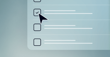
8. Use progressive disclosure for complex tasks
Presenting too much information at once can lead to a “freeze” response. Break down long forms or complex instructions into small, manageable steps. By revealing only the information needed for the current task, you prevent sensory overload and help users complete their goals without feeling overwhelmed.
accessiBe: Your partner for inclusive design
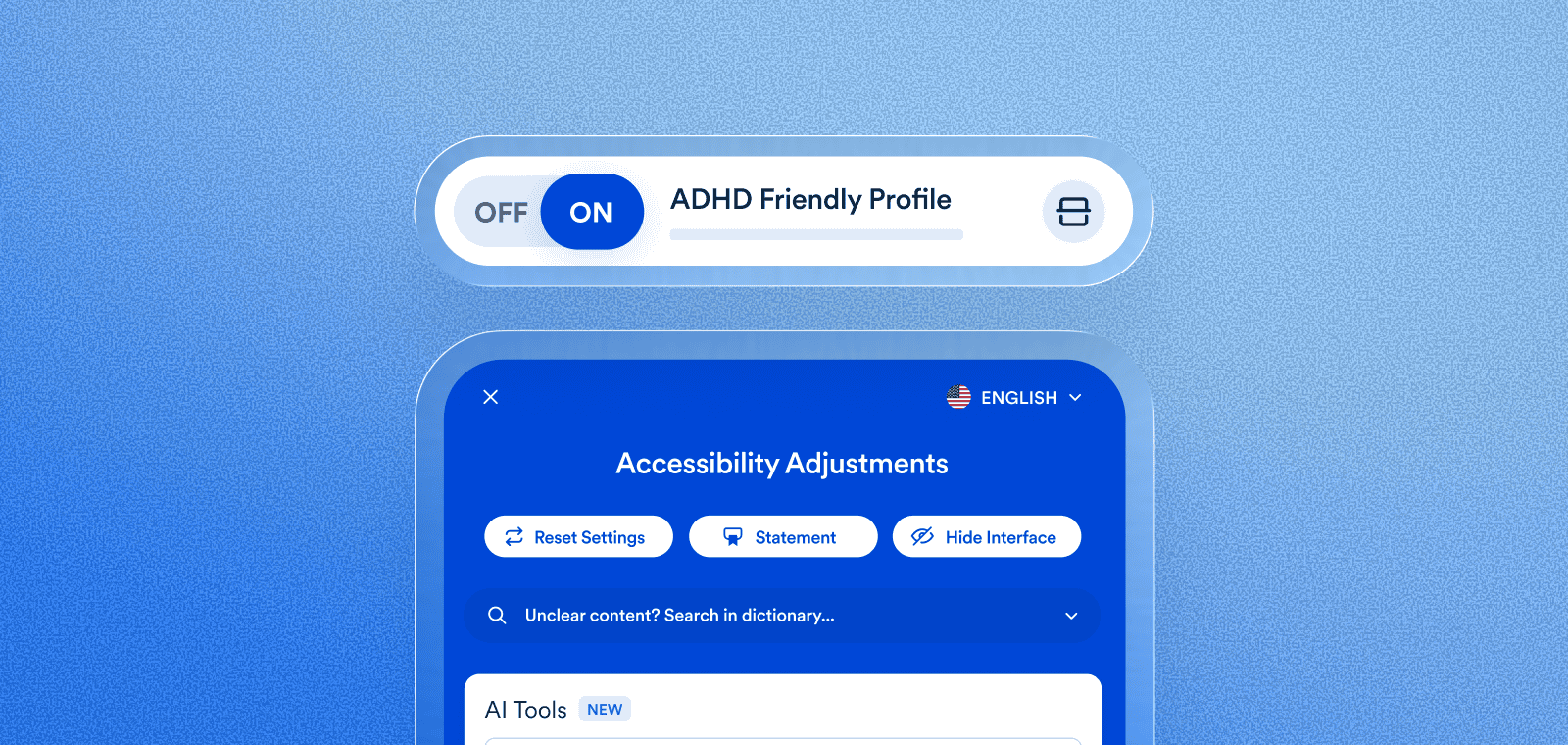
Designing for human variation doesn’t have to mean rebuilding your entire website from scratch. More than 100,000 websites use accessWidget, accessiBe’s AI-powered, end-to-end accessibility solution designed to give people with disabilities a user experience tailored to their unique needs.
Along with its automated remediations and ongoing accessibility status maintenance, accessWidget presents users with disabilities with an interface which allows them to customize design and UI elements to better support their specific sensory and cognitive preferences.
Users can activate specialized profiles—like the ADHD Friendly Profile or the Cognitive Disability Profile—that instantly apply a “calm mode” to your pages by stopping animations and highlighting essential information.
Press here to learn more about accessWidget’s interface.
Designing for human variation: A standard for the future
The shift toward neuro-inclusive design is more than a technical trend—it’s a move toward a more empathetic and effective digital world. When you prioritize the sensory and cognitive needs of the neuro-minority, you create a cleaner, more intuitive environment that benefits every single visitor to your site.
Embracing these design principles helps ensure your website is in compliance with the ADA and reflects a commitment to true digital inclusion. By providing tools that respect human variation, you move beyond theoretical checkboxes and build a digital space that is genuinely welcoming to every brain.