In today’s competitive marketplace, ensuring that your digital content is accessible is not just a matter of compliance, it’s a part of every future-thinking business strategy. Accessible documents help you reach a broader audience, including people with disabilities, who comprise a significant and often underserved market. By making your documents accessible, you enhance your brand’s reputation as inclusive and forward-thinking while improving your content’s usability for everyone.
Accessibility optimizes your content for all users. When your documents are designed to be accessible, they are easier to navigate, read, and understand, leading to better user experiences and more successful business outcomes. Here’s how you can ensure your documents are accessible.
The Basics of Accessible Documents
Use Proper Headings
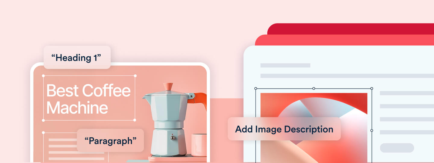
Headings are more than just stylistic elements; they are essential for organizing content and aiding navigation. When you use a logical hierarchy of headings—such as Heading 1 for main titles, Heading 2 for sections, and Heading 3 for subsections—you create a structure that screen readers can interpret correctly. This allows users to quickly navigate through the document and understand its structure, which is particularly beneficial in lengthy or complex documents.
Provide Alternative Text for Images
Images can convey important information, but for users who are blind or have low vision, this information is lost without descriptive alternative text (alt text). Alt text is a brief description that a screen reader can relay to the user, ensuring that the content of the image is accessible. When writing alt text, focus on the essential information that the image is intended to convey. For example, if an image shows a chart, the alt text should summarize the data trends shown in the chart.
“Perhaps the most fundamental principle to making a document accessible to a person who cannot see it is to ensure that the text in the document is actually digitally-coded text (e.g., ASCII) and not a picture of text. Bottom line, if you want to sell something, clarify a position, or simply convey information, be sure your words and sentences are written as coded text and not as pictures of text.”
– Curtis Chong, Advocate and Nonvisual Access Technology Consultant, National Federation of the Blind (NFB)
Use Meaningful Hyperlinks
Hyperlinks should be clear and descriptive, providing users with an idea of what to expect when they click the link. Instead of using vague text like “Click here,” use descriptive phrases like “Download the annual report” or “Learn more about accessibility guidelines.” This practice not only improves accessibility but also enhances the overall user experience by making it easier for all readers to understand the purpose of each link. Additionally, hyperlinks should be visually distinguishable through more than just color—consider using underlining or bold text to ensure that links stand out.
Ensure Sufficient Color Contrast
Color contrast is a critical factor in readability, especially for people with visual impairments. Text and background colors need to have sufficient contrast to ensure that content is easily readable. Tools like color contrast checkers can help you ensure that your document meets accessibility standards. The Web Content Accessibility Guidelines (WCAG) recommend a contrast ratio of at least 4.5:1 for normal text and 3:1 for large text.
Choose Accessible Fonts
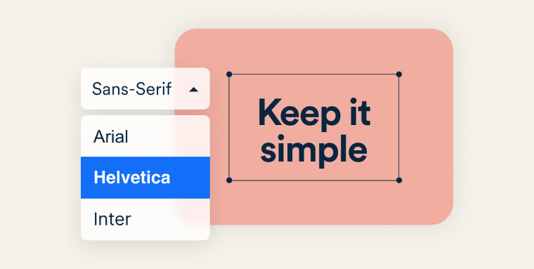
The choice of font can significantly affect readability. It’s best to use clear, simple fonts and avoid overly decorative styles that can be difficult to read. Fonts like Arial, Verdana, and Times New Roman are generally safe choices. Additionally, ensure that the text size is large enough to be read comfortably. While 12-point font is typically standard, consider increasing the size for headings and important information.
Use Lists for Structure
Lists are a great way to organize information into digestible chunks. Whether you’re using bullets or numbers, built-in list formatting helps break up content and makes it easier for users to scan and understand. Screen readers can also easily interpret lists, which enhances navigation for users with disabilities.
Create Accessible Tables
Tables should be used for presenting data, not for layout purposes. When creating tables, include headers for rows and columns to help users understand the information. For complex tables, consider providing a summary or description that explains the table’s content. This ensures that all users, including those using screen readers, can fully comprehend the data.
Verify Accessibility
Once you’ve created your document, it’s essential to verify its accessibility. Most word processing and PDF creation software includes built-in accessibility checkers that can help you identify and fix issues. Running an accessibility check should be a standard part of your document creation process to ensure that your content meets accessibility standards.
Use Built-in Space Features
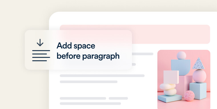
To maintain consistency and readability, use the built-in spacing features in your word processor rather than manually adding spaces between sentences or paragraphs. This approach ensures that the document remains accessible across different devices and screen sizes.
Don’t Forget Metadata
Metadata, such as the document title and language setting, plays a crucial role in accessibility. This information helps screen readers and other assistive technologies understand and present your document correctly. Always ensure that your documents have the necessary metadata before finalizing them.
Best Practices for Different Formats
Word Documents
When working with Word documents, accessibility features are often built-in but must be used correctly. Here are some best practices:
- Use built-in styles for headings and text to ensure a logical structure.
- Add alt text to all images to make them accessible.
- Ensure proper tab order for forms to help users navigate efficiently.
- Use descriptive link text rather than generic phrases like “Click here.”
- Create columns using the built-in layout features instead of manually adjusting spacing.
- Provide a table of contents for longer documents to aid navigation.
- Avoid using watermarks and background images, as they can create contrast issues that make text difficult to read.
PDFs
Creating accessible PDFs requires a few additional steps:
- Use tags to define the document structure, which helps screen readers interpret the content correctly.
- Ensure that the reading order is logical and easy to follow.
- Add bookmarks to facilitate navigation within the document.
- Include accessible form fields to ensure that all users can interact with forms.
- Make sure links have an Alternative Description or alternate replacement text to explain their purpose.
- Manually set and verify the document’s tab order to ensure that users can navigate efficiently.
Spreadsheets
Spreadsheets, particularly those with complex data, require careful attention to accessibility:
- Use simple, clear table structures that are easy to navigate.
- Include alt text for charts and images to convey essential information.
- Avoid using merged cells, as they can confuse screen readers and make navigation difficult.
Expand Your Reach with Accessibility
Investing in accessible document design is a strategic move that offers significant business benefits. By creating content that is accessible to all, you can tap into a broader audience, including people with disabilities, enhance customer satisfaction, and strengthen your brand’s reputation as inclusive and user-centric. Accessibility improvements also tend to make content easier to use for everyone, which can lead to increased engagement and loyalty. Ultimately, accessible documents are not just a compliance requirement—they are a way to demonstrate the values of your business and ensure your content resonates with the widest possible audience.
Frequently asked questions about creating accessible documents
Q1. What makes a document accessible?
A1. An accessible document is structured so people with disabilities can read, navigate, and understand it using assistive technologies like screen readers.
Q2. Which file types can be made accessible?
A2. Most common formats—PDF, Word, PowerPoint, and Excel—can be made accessible when they follow WCAG-aligned practices.
Q3. Do headings really matter?
A3. Yes. Clear, logical heading structure helps screen readers identify sections and makes documents easier to navigate for everyone.
Q4. Why do images need alt text?
A4. Alt text describes the purpose or meaning of an image so users who cannot see it still understand the content.
Q5. What role does color contrast play?
A5. Adequate contrast ensures text is readable for users with low vision or color blindness and aligns with WCAG requirements.
Q6. Do tables need special formatting?
A6. Yes. Tables should use defined header rows and simple layouts so screen readers can read them correctly.
Q7. Is exporting a PDF enough to make it accessible?
A7. No. PDFs often require additional checks, such as tagging, reading order adjustments, and alt text review.
Q8. How often should documents be checked for accessibility?
A8. Periodically—especially after content updates, branding changes, or format conversions.
Q9. How does accessiBe help with document accessibility?
A9. accessiBe offers professional document remediation through accessServices, where experts review and update PDFs, Office files, and other formats to support WCAG 2.1 Level AA alignment. Customers receive accessible final files and validation reports that support ongoing ADA compliance efforts.
