The Web Content Accessibility Guidelines (WCAG) have become increasingly well-known as businesses like yours learn about the importance of web accessibility. To create websites and digital assets that are inclusive, there’s more to it than coding and development.
Design is integral for digital assets that people with disabilities can access and engage with, without obstacles. Designers today need to consider the diverse needs and abilities of all users during their creation process to not only meet compliance requirements but also to ensure that the experience is positive for all users.
At accessiBe, we are committed to inclusive and accessible design. Our designers showcase this dedication daily, so who better than them to share our core design principles to learn, love, and live by.

Principle #1: Focus on Readability
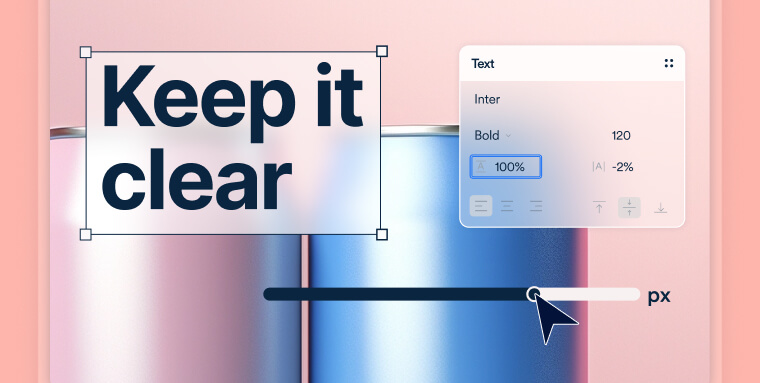
Every aspect of your content’s presentation is impacted by design. The font and the size of the text are both important and must be inclusive. As a whole, the text in any visual must be comfortable to read and understand.
“As a web graphic designer for brands, I make sure I’m using big enough fonts, choosing easy-to-read ones, spacing out letters and lines well, and keeping a high contrast between text and background colors.” – Tara Varon, Senior Web Brand Designer
Text Size
The WCAG doesn’t state which font sizes are truly accessible to people with visual disabilities for optimal readability, your designer should take into consideration certain best practices that make text more readable. Google recommends a font size of 16px.
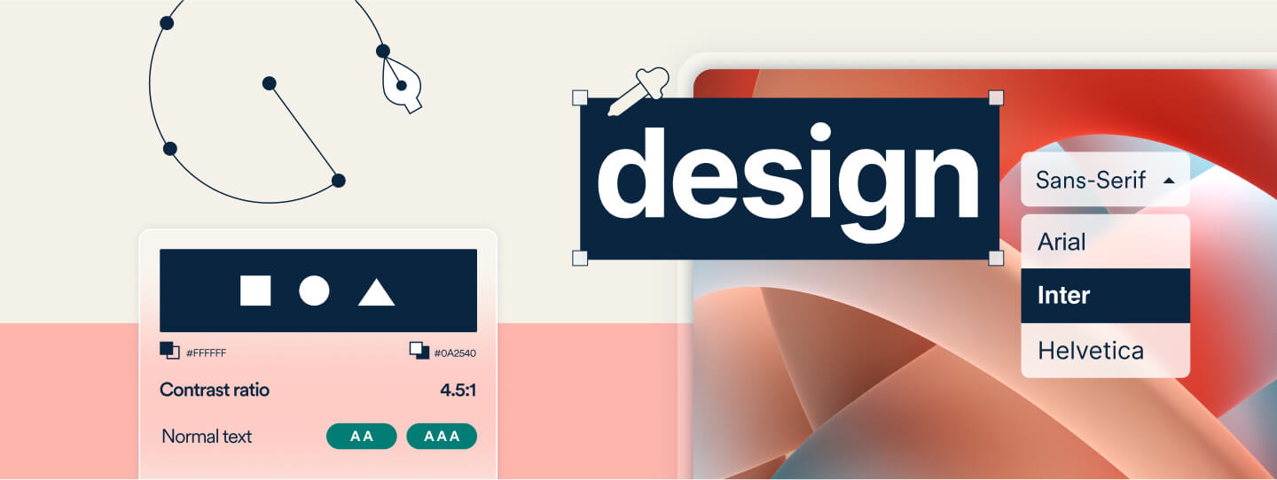
Font Style
The WCAG also doesn’t specify accessible font types, but using easily readable fonts is always recommended. Sans-serif fonts, such as Arial or Helvetica, are considered the most legible and inclusive to people with disabilities.
Principle #2: Invest in responsive design
Responsive design, when considering inclusivity, refers to whether a website and its digital content can adapt and provide a user-friendly experience across various devices and screen sizes. Most guidelines stress the importance of creating designs that are responsive to different devices like desktop computers, laptops, and mobile phones. Making sure that text can be adjusted and accessed, no matter which device it’s on, is crucial to a designer’s skillset.
Scalability
The WCAG recommends that text should be resizable without assistive technology and it should go up to 200% in scale without loss of content or functionality. This is to ensure readability for users with low vision. And, any designer should make sure that paragraph spacing is scalable to at least 2 times the font size, letter spacing is scalable to at least 0.12 times the font size, line height is scalable to at least 1.5 times the font size, and that word spacing is scalable to at least 0.16 times the font size.
“As product designers, we must adhere to our design system, ensuring consistency and scalability in terms of colors and text sizes. Moreover, if I decide to blend colors and fonts, it is essential to ensure it maintains extensibility.” – Ari Kushmirak, Product Designer
Principle #3: Always Use Colors Carefully
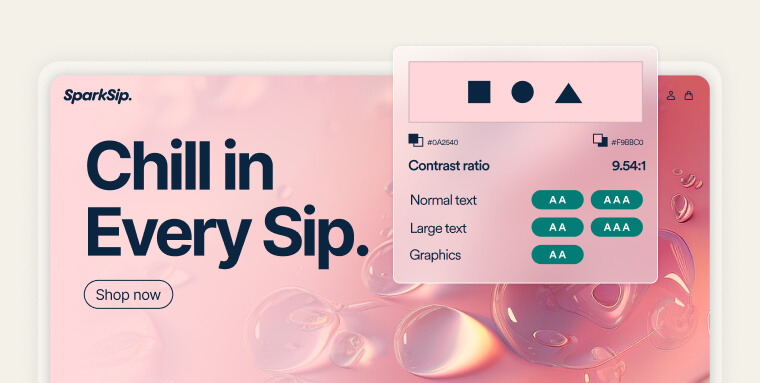
For people with low vision or visual disabilities, your designs must have the proper color and contrast to ensure that text and images are easily distinguishable from their backgrounds. The same concept applies to buttons, form fields, and any other control element that has a border. The WCAG 2.1 specifies a contrast ratio of at least 4.5:1 for normal text and 3:1 for large text or elements with borders.
“I ensure there’s enough contrast between text and background colors by using the Figma contrast checker plugin. This ensures that text is easily readable for all users.” – Tara Varon, Senior Web Brand Designer
But remember; your designer should also avoid using color as the only means of conveying information to a user. People who are color-blind require another cue, such as text, to understand the full context of a visual, and relying on color-coding to indicate information or an action excludes them from the content. A designer can also use bold, italics, or underlining as additional cues to indicate information or action.
“To enhance inclusivity, I integrate color with other visual elements, such as icons, patterns, or labels, to improve inclusivity. This approach ensures that information is conveyed clearly without relying solely on color perception, accommodating users with diverse visual abilities.” – Sapir Kadosh, Brand and Broadcast Design Team Lead
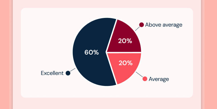
Principle #3: Be Considerate With Charts and Graphs
Pie charts and graphs can be challenging to design accessibly for several reasons. Both types of designs primarily convey information visually, which poses a challenge for people who are blind or have low vision. Graphs often represent complex information that can be hard to describe briefly in text. This makes it tough for screen readers to communicate the same level of detail and nuance that sighted users get at a glance. To help, design with these tips in mind.
- Provide Text Descriptions: Accompany pie charts and graphs with descriptive text that explains the data and key findings. This helps users with visual disabilities who use screen readers to understand the content better.
- Include Patterns or Textures: Use patterns or textures to differentiate segments of a pie chart or elements within a graph. This helps users who need help differentiate colors.
- Simplify and Streamline Design: Avoid cluttering the chart or graph with too much information. A simple, clean design is more accessible.
Logical Structure: Structure the content logically. For example, in pie charts, consider arranging segments in a way that is easy to follow, like in descending order of size. - Alt Text for Digital Content: When the chart or graph is used in digital formats, including alternative text that describes the essential information conveyed by the visual.
“I use color and other graphic elements such as text labels, strokes, or an icon, together. For example, if I use red and green indicators, I also include labels like “Success” or “Error.” This ensures that users can understand the context even if they cannot perceive the colors.” – Amit Eytan, Web Brand Designer
Principle #4: Anything Moving Should Be Safe
It’s your designer’s job to create motion graphics in a way that does not induce seizures. This means avoiding flashing, blinking lights, or other visual elements that have a high risk for people with epilepsy.
“I always avoid flashes and high-contrast color changes in a video. When I’m shooting a video, I avoid fast camera movements and flashing lights.” – Assaf Haber, Senior Motion Designer
Flashing Content
While it remains recommended to opt out of flashing content entirely, the WCAG states avoiding anything that flashes more than three times in one second. This guideline helps reduce the risk of seizures caused by strobe effects.
Pause, Stop, Hide
The WCAG emphasizes that providing users with control over moving content is an important inclusive design practice. In short, options to pause, stop, or hide moving, blinking, or scrolling content must be available if the content starts automatically, lasts more than five seconds, and is presented in parallel with other content. Options to control the moving content ensure that people with cognitive disabilities can interact with and understand the content without being distracted or overwhelmed.

Principle #5: Don’t Skip the Media Content
For any video or audio content, your designer should provide alternative options like captions, audio descriptions, and transcripts. These accessibility options are crucial for people who are deaf, hard of hearing, blind, low vision, or deaf-blind.
Transcripts
For synchronized audio-video content, an alternative should be provided, such as a text transcript. The transcripts themselves should include anything meaningful to the content’s user experience such as environmental sounds, speaker identification or actions, descriptions of visual content, and any other element that provides context. Tools such as Otter.ai, Sonix, Trint, and Google’s Live Transcribe can provide text transcripts.
Captions
Provide captions for all pre-recorded audio content and live audio content. The WCAG explicitly states that captions must be accurate, synchronous, accessible, and provide an equivalent experience to that of hearing users. This means that captions should include not only dialogue but also an identification of who’s speaking and other significant sounds, like laughter, music, or sound effects. Tools like Rev.com, Amara, Adobe Premiere Pro, and Aegisub can assist in caption creation.
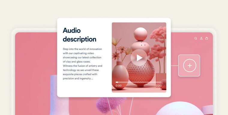
Audio Descriptions
Provide an audio description for all pre-recorded video content to ensure that all visual information is conveyed to users who are blind or have low vision. This offers a complete understanding of the overall context of the content. Like text transcripts, audio descriptions should include all meaningful visual descriptions representing the video. Tools like YouDescribe, 3Play Media, and Descript can provide audio descriptions.
“For tutorial videos, I make sure that the narration describes every aspect that appears on the screen to make it accessible for people with visual disabilities.” – Assaf Haber, Senior Motion Designer
Principle #6: Test Your Designs for Accessibility
Tools like WAVE or Google Lighthouse can help your designers evaluate web pages for accessibility issues. While these are more developer-oriented, they can still provide insight into color contrast and text size which are relevant to designers. A designer can also use online tools like the WebAIM Color Contrast Checker to ensure that text and background colors have sufficient contrast.
“When designing a storyboard in Figma, I check the colors using the contrast plugin. For videos, I use a software called PEAT that tests if the video is seizure-safe.” -Assaf Haber, Senior Motion Designer
Testing designs on various devices and screen sizes to ensure they are accessible and usable across all platforms comes highly recommended. To understand the user experience and its barriers, designers should engage with it themselves.
“I make sure to check my designs on different-sized screens. I also always check my designs on different platforms so I can see that the font sizes and images are good on all kinds of screens.” – Amit Eytan, Web Brand Designer
If possible, take it a step further and involve users with disabilities in your testing process. They can provide invaluable feedback on the usability of a design from an accessibility perspective.
A Designer’s Job is Never Done
Don’t forget that inclusive and accessible design means staying up to date with best practices and guidelines as they evolve.
Businesses that prioritize accessibility should make sure their designers complete a required training process in accessible design. Subscribe to newsletters and blogs that focus on web accessibility and inclusive design to gain insight from experts in the field who share their knowledge through these channels. There are many workshops, webinars, and conferences on web accessibility and inclusive design being offered.
“I regularly participate in conferences, webinars, and workshops on accessibility and inclusive design. Keeping abreast of updates to WCAG guidelines and other relevant standards ensures that my designs remain aligned with the latest industry best practices.” – Sapir Kadosh, Brand and Broadcast Design Team Lead
Events like the CSUN Assistive Technology Conference and M-Enabling Summit offer valuable learning opportunities.
Most importantly, remember to always advocate for inclusion and accessibility in design while constantly improving skill and knowledge, ensuring that people with disabilities are fully included in your brand’s visual assets.
Frequently asked questions about inclusive design
Q1. What is inclusive design?
A1. Inclusive design is an approach that creates digital experiences usable by people with diverse abilities, backgrounds, and needs. It emphasizes flexibility, clarity, and choice so that more individuals can engage with your content comfortably and independently.
Q2. How does inclusive design differ from accessibility?
A2. Accessibility focuses on removing barriers for people with disabilities and is guided by standards such as WCAG. Inclusive design takes a broader approach and considers a wider range of human differences, helping create experiences that work well for everyone, not only those with specific disabilities.
Q3. Why is inclusive design important for digital products and websites?
A3. Inclusive design makes digital experiences more intuitive, predictable, and enjoyable for all users. It reduces friction, supports clearer communication, and helps ensure that content and interactions work well across devices, abilities, and environments.
Q4. Does inclusive design help with ADA compliance?
A4. Yes. Although inclusive design is broader than accessibility, applying its principles often leads to experiences that align more closely with ADA expectations. WCAG remains the widely accepted framework organizations use when working toward digital accessibility under the ADA.
Q5. What are common barriers inclusive design helps address?
A5. Inclusive design helps prevent issues such as low color contrast, complex navigation, inconsistent layouts, inaccessible forms, unclear language, and interactions that depend solely on mouse or touch input. Addressing these barriers supports a smoother, more predictable experience for all users.
Q6. Can inclusive design improve overall user experience?
A6. Absolutely. Many accessibility and inclusive design practices overlap with strong UX design. Clear structure, readable text, intuitive navigation, and consistent patterns help all users engage more confidently and efficiently.
Q7. How can teams implement inclusive design early in a project?
A7. Inclusive design works best when incorporated from the beginning. Early steps often include diverse user research, clear content strategy, semantic structure, and collaboration between designers, developers, and accessibility specialists as the product evolves.
Q8. Is inclusive design a one-time effort or an ongoing practice?
A8. Inclusive design is ongoing. User needs change, content evolves, and technologies update over time. Regular reviews, testing, and refinement help maintain an inclusive experience that continues to support a wide range of users.
Q9. How can organizations evaluate whether their designs are truly inclusive?
A9. Many organizations review their digital products using a combination of usability testing, accessibility audits, assistive technology testing, and user feedback. Testing with real users who have diverse needs provides especially valuable insight.
Q10. How can accessiBe support organizations working toward more inclusive design?
A10. accessiBe offers end-to-end accessibility solutions that combine AI-driven insights, human expertise, and developer tools. accessFlow helps development teams perform in-depth audits, maintain continuous monitoring, and carry out detailed remediation workflows. accessWidget supports user experience enhancements through session-based accessibility adjustments and AI-powered background remediation. accessServices provides expert-led support through accessibility audits, document remediation, multimedia accessibility, and user testing to help organizations create inclusive, accessible digital experiences.
