Given that designing with accessibility in mind benefits all users, you should naturally gravitate toward accessible color combinations.
However, if you are based in Ontario, Canada, you more than likely are mandated by law to select such colors, under the Accessibility for Ontarians with Disabilities Act (AODA).
In this blog, we will cover everything you need to know about AODA-compliant colors.
We will show why choosing the right color combination is so important, and what you should expect if your website is found to feature color schemes and contrasts that stand in violation of the AODA. Of course, we will also show you how to choose AODA-compliant colors, and highlight those you should avoid.
Important note: To assist in your internal documentation and ensure your color choices meet these legal standards, you can use the W3C Accessibility Evaluation Report Template to track and record your website’s conformance results. This is particularly useful for the upcoming mandatory December 31, 2026 compliance report required for all Ontario organizations with 20 or more employees.
- To comply with the Accessibility for Ontarians with Disabilities Act (AODA), you need to ensure your website conforms to the Web Content Accessibility Guidelines (WCAG) at Level AA
- Conforming to WCAG at this level requires meeting a number of design-based criteria, that include ensuring proper color contrasts
- These pertain to meaningful and text and their background, along with meaningful icons and their backgrounds
- Certain color combinations will prove problematic in ensuring the proper contrast requirements, while others allow for optimal readability and accessibility
AODA-compliant colors: an overview
The Accessibility for Ontarians with Disabilities Act (AODA) exists to improve the accessibility standards for Ontarians with physical and mental disabilities within the province of Ontario, Canada.
Under the AODA, most businesses and organizations providing goods, services, or facilities to the public, and having at least one employee in Ontario, must make their services and products accessible to people with disabilities.
The AODA includes specific instructions pertaining to organizations’ physical and online domains.
These detail what organizations must do to their facilities, along with their websites and web-based applications so that they are accessible to members of the disability community and in compliance with the law.
The AODA points to specific web accessibility guidelines as the standards organizations and businesses must adhere to under the law.
These guidelines are called the Web Content Accessibility Guidelines (WCAG).
Created by the World Wide Web Consortium (W3C), WCAG is considered to be the most important standard shaping global web accessibility policy today.
While there are a number of WCAG versions, under the AODA websites and web-based applications must conform to WCAG 2.0, an earlier version of these guidelines, at Level AA.
WCAG’s role in choosing AODA-compliant colors
To select AODA-compliant colors, websites need to adhere to the sections of WCAG that apply to color contrasts. For the most part, these sections touch on:
- Selecting a suitable color contrast between text and its background
- Selecting an appropriate color contrast between significant non-text elements and their background
- Not relying solely on color to convey information, prompt actions, elicit responses, or distinguish visual elements.
- Ensuring that information conveyed via color is complemented by text, patterns, or visual cues
- Ensuring graphic elements like charts and maps have sufficient color contrast
AODA-compliant colors: a deep dive
To ensure you are selecting color combinations that conform to WCAG 2.0 Level AA (i.e., the AODA’s standard for web accessibility) you should consider the following action items:
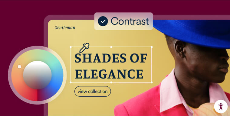
Choose the right color combinations
Most of us instinctively recognize attractive, captivating color pairings. However, those with specific vision issues may not.
During the design phase, combinations of colors that are similar in tone, intensity, or luminosity might seem appealing. But such combinations can limit people with certain vision impairments’ ability to access vital information.
So, which color mixtures should you think about incorporating to make sure your website complies with the AODA?
You should consider the following:
- Black and white: Being the most highly contrasting color combination, black and white color schemes are a go-to for those interested in their website being as accessible as possible. And although you may think that such a basic color combination allows for limited creative options, many of the world’s leading websites rely heavily on it, leveraging it to great effect
- Yellow and blue: Being far enough away on the color spectrum to allow for significant contrast, yellow and blue can prove to be a striking and accessible color combination. It is important to note, however, that some shades of yellow do not sufficiently contrast with a blue background
- Red and white: Darker shades of red contrast with white backgrounds in a way that is both visually stimulating and highly accessible. It is important to note, however, that some shades of red and white do not sufficiently contrast with each other
- White and green: White and green can prove both highly accessible and aesthetically pleasing. It is important to note, however, that some shades of green and white do not sufficiently contrast with each other
Conversely, there are a number of color combinations that often do not sufficiently contrast with each other.
If you are set on using them, you will need to test specific shades of these colors to ensure they properly contrast. These combinations include, but are not limited to:
- Blue and black
- Blue and purple
- Green and blue
- Purple and black
- Red and brown
- Red and green
- Yellow and green
- Yellow and orange
- Yellow and red
Make sure that text is readable
Ensuring text legibility is crucial when selecting a contrasting color scheme, particularly concerning text. Under WCAG 2.0 Level AA, text must maintain a minimum contrast ratio of 4.5:1 with its background. For larger text (18-point) or 14-point bold text, a ratio of 3:1 is acceptable.
By adhering to these guidelines, individuals with vision impairments will be able to perceive the presence of text, enabling them to read and comprehend its content.
Here are a few examples of web pages that feature the required contrast ratios:
1. Simply Stated

On this web page, the contrast between text and background is as low as 7.47:1 and as high as 11.71:1.
2. SHAD Canada
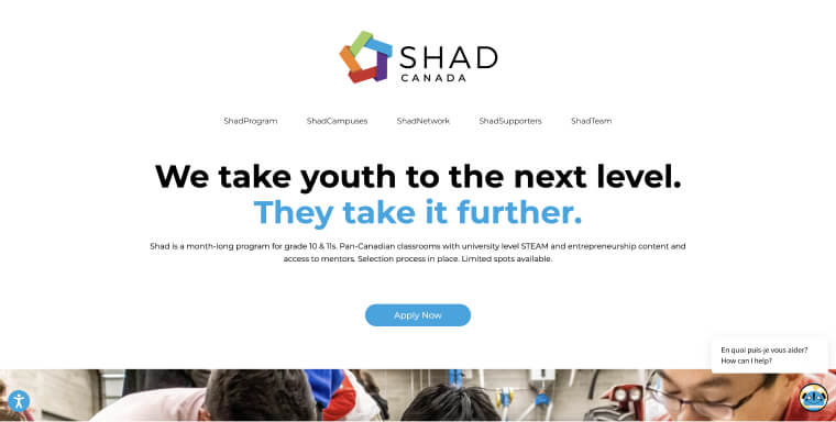
On this web page, the contrast between text and background is as high as 19.44:1
Ensure icons, checkboxes, and other functional graphics feature proper color contrast ratios
WCAG color contrast requirements apply to all meaningful information displayed on your website, encompassing both text-based information and visual elements.
Visual elements include interface components, meaningful icons, and other graphical objects that are instrumental for comprehending functionality or content featured in a website.
Examples of meaningful icons include, but aren’t limited to:
- The envelope icon representing an email or message
- The shopping cart icon symbolizing an online shopping cart or the act of adding items to a cart
- The camera icon indicating the option to take a photo or access the photo gallery
- The gear icon representing settings or configuration options
Under WCAG, colors incorporated within meaningful icons and graphics will need to properly contrast with adjacent colors. The contrast needs to be in place even when the icon is focused or hovered over.
How can I test whether I’m using AODA-compliant colors?
The following tools will help you test how well the text you display on your website and web-based applications contrasts with its background color:
- ColorPick Eyedropper: A free Google Chrome extension, this tool can be used to determine the exact color of various elements appearing on a web page. You can hover over text and images with your cursor and find color values in real time
- Adobe Color Contrast Analyzer: A free tool by Adobe, this tester allows you to upload screenshots of your mockups and pin two areas within the image to evaluate their contrast ratio
- WebAIM Color Contrast Checker: A free color accessibility checker into which you can submit a foreground color and a background color and examine their contrast ratio
- NoCoffee Vision Simulator: A free Google and Firefox extension, this tool allows you to experience your website or mockup as if you through the lenses of people with various vision impairments
- Color Contrast Analyzer: A free Google Chrome extension you can install to analyze an entire web page or parts of it for color contrast. The tool can also be applied to images and PDF files
It’s important to note that color combinations and schemes are only one part of a list of elements you will need to examine to determine whether your website complies with the AODA.
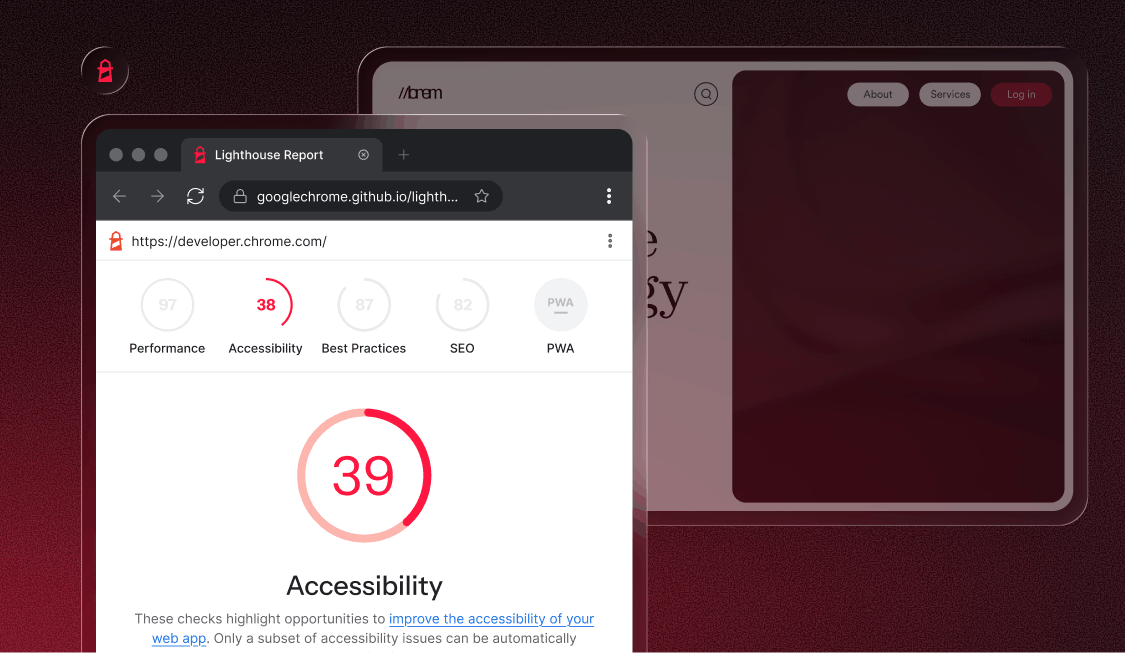
To get a clear understanding of your website’s state of compliance, you can use automated testing tools, like accessScan.
A free AODA website compliance testing tool, accessScan will run a quick, automated audit of your website, examining its level of conformance to WCAG 2.1 Level AA.
After checking your web page’s various design and UX elements (including color contrasts and combinations), accessScan will assign your website a score: Accessible or non-compliant.
You will also be presented with a more detailed breakdown of your website’s AODA compliance status, which you can download as a PDF.
Accessibility issues found during the automated test will be highlighted in the report, along with instructions on how to address and fix them.

AODA-compliant colors: other areas to look out for
- AODA-compliant colors within online documents: Under the AODA, most Ontario-registered organizations need to ensure that the online documents they feature on their websites can be accessed by members of the disability community. To be considered AODA-compliant, online documents must contain certain elements. Most notably, they will need to be properly-tagged to allow for screen reader usage. Additionally, and similarly to websites, your PDFs and Microsoft Office files (e.g., Word documents) will need to feature sufficiently contrasting colors. It is important to keep this in mind when designing your online documents
- Accessible colors within physical domains: The AODA has specific instructions pertaining to accessibility within physical facilities, as well as websites. Under the AODA, signs and other physical materials need to be presented in an accessible way. Signs will need to feature legible text that sufficiently contrasts with its background. You can click here to read more about color contrast for signage under the AODA
Why is choosing AODA-compliant colors important?
The vast majority of the web is still partially or fully inaccessible to members of the disability community. Selecting accessible, AODA-compliant color schemes is one of a few important design steps that Ontario-based organizations can take to end this discriminatory reality.
With their consumer base clearly preferring businesses that accommodate the disability community, Canadian organizations should be inspired to take the necessary measures to help bridge accessibility barriers within their online domains.
It’s important to note that selecting highly contrasting color schemes elevates a website’s overall readability.
Along with being a core tenet of great, effective web design, readability can positively impact your website in other ways, such as by enhancing its chances of ranking in search engines.
Finally, as the AODA is a provincial law, organizations that fail to comply with it can face legal recourse, including receiving fines and facing lawsuits.
Along with the financial ramifications that come with such issues, legal recourse can negatively affect your brand reputation and lead some to believe that you do not pay the disability community the respect it deserves.
Closing thoughts
January 1st 2025 was the deadline by which businesses needed to adjust their websites and digital assets so that they comply with the AODA.
Organizations need to take action now, to enusre their websites can be accessed by everyone, regarldess of ability. This will entail opting for specific color contrasts within websites, online documents, and for physical signage.
By doing so, organizations optimize their website’s overall readability and considerably expand their potential customer base.
Frequently asked questions about AODA-compliant colors
Q1. What does AODA require for accessible colors?
A1. The AODA requires organizations to provide accessible digital content, and most color-related requirements come from following WCAG 2.0 Level AA.
Q2. What is the minimum color contrast ratio under WCAG 2.0 AA?
A2. Normal text must meet a contrast ratio of at least 4.5:1, while large text must meet at least 3:1.
Q3. Why does color contrast matter for accessibility?
A3. Strong contrast helps users with low vision, color blindness, or visual fatigue read and understand content more easily.
Q4. Can color alone be used to convey information?
A4. No. WCAG requires additional cues—such as icons, labels, or patterns—so people who cannot perceive certain colors still understand the content.
Q5. Are bright or neon colors considered accessible?
A5. Not always. Vibrant colors can reduce readability or strain the eyes. Accessibility depends on the contrast between text and background, not brightness alone.
Q6. How do gradients or textured backgrounds affect accessibility?
A6. Gradients and textures can make text harder to read. Text should have consistent contrast throughout the entire character shape.
Q7. Do images containing text need to meet contrast requirements?
A7. Yes. Text embedded in images must meet the same WCAG contrast ratios unless the text is purely decorative.
Q8. Are dark mode or high-contrast themes required for AODA?
A8. Not required, but offering options like dark mode, high contrast, or color adjustments supports a more inclusive user experience.
Q9. How does accessiBe help organizations meet AODA color accessibility expectations?
A9. accessiBe provides solutions that combine AI-driven remediation, automated scanning, manual audits, developer tools, and expert services. These tools help organizations identify and correct color-related accessibility issues, align with WCAG 2.0 Level AA, and support ongoing AODA compliance efforts.