If you are a federal agency, a federally-funded organization, or a service provider to a federally-funded organization, you must comply with Section 508 of the Rehabilitation Act.
Under Section 508, you need to ensure that your website and online documents, along with other information and communication technology (ICT) products, meet specific web accessibility guidelines.
These guidelines feature instructions on various design elements, including fonts.
In this guide, we’ll explore font styles and families you should use on your website for optimal accessibility. We’ll also highlight those you should avoid to create a welcoming online environment for people with disabilities.
Fonts to use to create an Section 508-compliant website:
- Calibri
- Veranda
- Helvetica
- Arial
- Century Gothic
- Tahoma
Selecting accessible fonts under Section 508
Section 508 of the Rehabilitation Act applies to federal agencies, organizations that receive federal funding, and service providers to these organizations. Under Section 508, information and communication technology (ICT) owned, developed, and procured by these organizations must be accessible to the disability community.
Section 508 sets a clear standard by which ICT is considered accessible, pointing to the Web Content Accessibility Guidelines (WCAG) 2.0 as its standard for compliance.
Developed by the World Wide Web Consortium (W3C), WCAG is considered by many to be the most important set of guidelines impacting global web accessibility policy.
While there are three different levels of WCAG conformance (i.e., Level A, Level AA, and Level AAA), under Section 508, ICT must conform to WCAG 2.0 Level AA.
WCAG’s application to fonts
WCAG includes a number of sections that apply to the way content should and shouldn’t be presented. These can help those who need to comply with Section 508 choose fonts that are most accessible to people with disabilities.
The most important WCAG sections that apply to fonts are:
- Web content should be presented in different ways: In regards to fonts, it is important to select one that is easy to read when resized or presented with different styling or spacing
- Web content should be easy to see or hear: To that end, it is important to consider font family, size, spacing, and color
We will expand on these principles and explain how they translate to specific font styles and families later in the blog. To skip that section, you can press here.
What content needs to incorporate accessible fonts?
Section 508 applies to information and communication technology (ICT). Examples of ICT that fall under the law include, but aren’t limited to:
- Websites
- PDFs
- Books
- Chat clients
Let’s break each of these down:
Websites
All text content on a website, including headers, body text, and captions, must feature accessible fonts. These fonts have various sizes, weights, and styles to make them easier to read.
Website text content that benefits from readable fonts includes, but isn’t limited to:
- Headings and subheadings
- Alternative text for meaningful images and visuals
- Navigation menus
- Call-to-action buttons or links
- Captions and transcripts for multimedia
- Form labels and instructions
- Error messages
- Link texts
Online documents
PDF documents meant for public consumption (along with other forms of online documents) should use accessible fonts. This includes manuals, reports, and other documentation. Accessible fonts enhance PDF readability for people who use screen readers and different devices.
Keeping accessibility in mind is imperative when it comes to public email correspondence, especially when responding to customers via email or sending newsletters.
Fonts that are too small or ornate can be difficult for people with limited vision to read. Large, clear, and legible fonts ensure people don’t miss critical information in emails.
Chat clients
Instant messaging and chat clients should incorporate accessible fonts to help people with vision impairments read the text. If your website has online chat features for customer service, make it easier for people to get support. Use larger font sizes, bolder typefaces, and higher contrast.
How to choose accessible fonts to achieve Section 508 compliance
WCAG-conforming fonts share the following traits:
- They are composed of letters and characters that are easily distinguishable
- Their design is simple
- Their size and weight allow for comfortable reading
- They do not feature letters that mirror each other
- They have enough spacing between characters and lines
- They aren’t decorative or italicized
- They sufficiently contrast with their background color
Let’s take a closer look at accessible font families, and examine how color and size impact font accessibility.
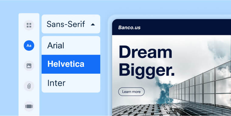
How to choose an accessible font family
The right font family can enhance accessibility and help visitors access and understand your content. It’s crucial to choose a font family that’s widely available and readable across various devices and platforms. Avoid obscure or proprietary fonts that not all web browsers support.
Another key consideration is the typeface itself. Serif fonts, which feature small lines or flourishes at the end of characters, may be unique and aesthetically pleasing. But they are much harder to read for people with vision impairments.
Sans-serif fonts, on the other hand, are preferred for their easy legibility and clean and simple lines. That said, both serif and sans-serif fonts can be accessible and inaccessible, and the idea that all serif fonts aren’t accessible is largely a myth.
Therefore, before selecting one, it is important to test a specific font family for accessibility.
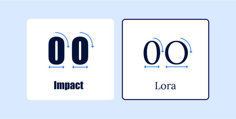
A key area you will want to examine is how easy it is to distinguish between certain number and letter pairings within a font family.
For example, some fonts can make it very difficult for readers to distinguish between the uppercase “O” and the numeral “0”. In the following example, the uppercase “O” and the numeral “0” are virtually identical when appearing in the Impact font. Conversely, there is a big difference between the two characters when appearing in the Lora font.
Another issue you should consider is “mirrored” typography.
For instance, in certain fonts, the lowercase letters “q” and “p” can look very similar when mirrored. It is therefore important to choose a font family in which these two letters are easily distinguishable.
In general, besides the numerical “0” and uppercase “O”, Google advises checking the following character pairs within a font family to make sure they are sufficiently distinct from each other:
- nu
- il1I
- qp
- db
- a8
- a6
- 6g
- rn, m
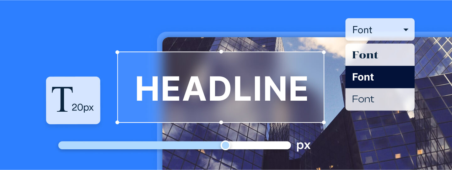
Size requirements for font accessibility
WCAG does not categorize specific font sizes as accessible. There are, however, some recommended measures that, if taken, will make text more easily readable for people with vision impairments.
A safe bet for a WCAG-conforming font size is 16px (or 1em or 1rem) as a bare minimum. This aligns with Google’s own text size recommendation.
Here are some other elements you should pay attention to:
Separate sizes for header classes:
Font size plays a crucial role in both readability and conveying the importance of content. People often scan headings to quickly locate specific information, allowing them to sift through sections they aren’t interested in.
To that end, you should use appropriate and different font sizes for various header levels. For instance, H2 headers should be larger in size compared to H3 headers
Ensure adequate text spacing:
To optimize text legibility, it is vital to pay attention to text spacing. According to WCAG, specific requirements for text spacing include:
- Ensuring line height is at least 1.5 times the font size
- Ensuring that the spacing following paragraphs is at least 2 times the font size
- Ensuring that spacing between letters is at least 0.12 times the font size
- Ensuring that spacing between words is at least 0.16 times the font size
It’s important to note that different font families exhibit variations in character width. Thus, one font family may appear more condensed compared to another, even when using the same spacing values between words. To determine the ideal spacing for a particular font, you can use the Google Fonts Type Tester.
Font color and color contrast
To conform to WCAG 2.0, the contrast ratio for regular text and its background should be at least 4.5:1. An ideal contrast ratio for large text is 3:1. When choosing font colors, avoid combinations like red and green, as they can make it challenging for people with color blindness to digest your content.
Tips for choosing accessible fonts
Using as few fonts as possible within your website or other information and communication technology (ICT) is always good practice.
Additionally, you may want to consider testing various fonts on real customers or website visitors, and asking for their feedback on them. This is especially important when you know that a group with a specific disability frequents your website and other ICT.
If there is a significant number of people with dyslexia in your audience, for example, you can present a few versions of a landing page featuring different fonts to existing customers. Then, they can rank those they find to be the easiest to read.
Just as importantly, empowering your website visitors to adjust font settings themselves can heavily impact the way they consume and understand content.
Tools such as accessWidget allow individual website visitors to modify design elements within your website to fit their abilities. These include adjusting font sizes, adjusting color contrasts so that fonts become more visible, and even replacing existing fonts with more readable ones.
Click here to read more about accessWidget and how it can help website visitors with disabilities.
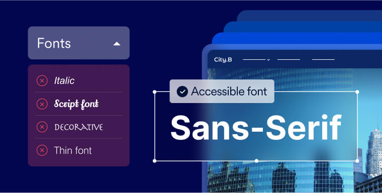
Fonts to avoid
The following fonts will prove challenging for many people with disabilities:
- Italic and oblique fonts: Slanted characters make content harder to digest for people with dyslexia or low vision
- Script fonts: Script fonts are based on cursive handwriting. Therefore, their letters are often not distinct from each other. People with dyslexia, low vision, and some other disabilities will find them very difficult to understand
- Highly decorative fonts: Fonts with intricate designs and embellishments can present challenges for some readers, especially those with cognitive impairments
- Thin fonts: Condensed fonts, especially at smaller sizes, don’t provide enough contrast with the background. As a result, people may have a hard time accessing and understanding the content
Examples of accessible fonts
Choosing a unique font for your website and online documents may sound like a cool idea. However, the more recognizable fonts are popular for a reason. They tend to be the most readable, legible, and friendly for the highest number of readers. Some of the most popular accessible font families include, but aren’t limited to:
- Arial
- Calibri
- Century Gothic
- Garamond
- Helvetica
- Tahoma
- Verdana
The importance of using accessible fonts
Featuring accessible fonts can have a major impact on people with disabilities attempting to engage with your website and other ICT. Whether your website and other ICT incorporates accessible fonts can have a deciding impact on the way people with specific disabilities interact with them.
Certain people with vision impairments and dyslexia, for example, can find themselves completely incapable of accessing vital information, if it is presented via thin, highly decorative fonts.
However, using accessible fonts very often will be appreciated by people outside of the disability community, as well. For the most part, people skim through web-based content, and don’t typically read pages word-for-word. To that end, a large, highly readable font can prove very helpful.
Furthermore, using highly legible and accessible fonts can impact your website’s ranking on search engines. Fonts significantly influence the level of readability on a website, and search engines like Google tend to favor websites that are deemed highly readable, leading to higher rankings.
Finally, it’s important to realize the legal ramifications of presenting inaccessible ICT under Section 508. The latter exists to protect the disability community from discrimination.
Organizations that need to comply with this law and fail to do so create unjust barriers for people with disabilities and can face legal action for doing so.
This includes receiving demand letters from advocacy groups and even facing lawsuits. This type of legal recourse is often time-consuming and costly, and can negatively impact your brand’s reputation.
Enhancing accessibility with readable fonts
To fully conform with WCAG and comply with Section 508, your website (along with your other ICT) will need to feature highly accessible fonts. Selecting the proper font family is critical in that regard. However, attention will need to be paid to other elements, such as how the font contrasts with its background color.
By acting on the information appearing above, you will see to it that your website and online assets truly accommodate people with disabilities.
Frequently asked questions about Section 508-compliant fonts
Q1. What makes a font “Section 508 compliant”?
A1. Section 508 doesn’t name specific fonts, but it requires digital content to meet accessibility standards such as WCAG. This means fonts must support readability: they should scale cleanly, use clear letterforms, be easily distinguishable, and work with assistive technologies.
Q2. What font characteristics should I look for?
A2. Choose fonts with simple, non-decorative shapes, strong character differentiation (so “I,” “l,” and “1” don’t look identical), ample spacing, and a solid x-height. They should remain legible when zoomed or resized.
Q3. Are there specific fonts that work well for accessibility?
A3. Common, widely supported sans-serif fonts like Arial, Verdana, Calibri, Tahoma, and Century Gothic are generally good choices. Avoid script fonts, decorative styles, very thin weights, and fonts with highly stylized strokes that break down at small sizes or in low-vision conditions.
Q4. How does font selection relate to color contrast and spacing?
A4. A readable font can still fail accessibility if paired with low color contrast or cramped spacing. To meet Section 508 expectations, font choice must be considered together with contrast ratios, line height, letter spacing, and overall layout.
Q5. Do PDFs and digital documents need to follow Section 508 font rules too?
A5. Yes. Section 508 applies to websites, apps, documents, PDFs, forms, and other digital materials. All text elements—body copy, headings, labels, captions—must remain readable, scalable, and perceivable across formats.
Q6. Who is responsible for ensuring font accessibility in an organization?
A6. It’s a shared responsibility. Designers choose the fonts, developers apply them correctly, content teams ensure clarity and consistency, and accessibility or compliance teams verify conformance. Typography decisions should always be validated through accessibility checks.
Q7. Why is accessiBe helpful when evaluating font accessibility?
A7. accessiBe offers end-to-end accessibility solutions that help organizations identify font-related issues, assess readability in real contexts, and monitor changes over time. With the best in AI and human expertise, accessiBe supports teams in choosing accessible typography and maintaining long-term Section 508 adherence.