

Question answered in this report: What do AI-generated ecommerce storefronts actually look like from an accessibility standpoint — and does the quality of the prompt make a difference?
Two ecommerce storefronts were built using an AI-powered site generation platform, from prompts of very different complexity. Both were audited by professional accessibility specialists against WCAG 2.2 AA standards. Between them, the audits surfaced 24 accessibility issues including 8 critical failures. The critical failure profile was identical across both sites regardless of how detailed or simple the prompt was. AI site generation platforms produce visually professional output. Accessibility is not part of what they deliver by default.
AI apps and site generation platforms have done what drag-and-drop site builders promised but never quite delivered: genuinely democratizing the creation of sophisticated digital experiences. An ecommerce storefront that once required a development team, a design budget, and weeks of build time can now be created in an afternoon by someone with no technical background. That’s a meaningful shift — and for ecommerce specifically, where the barrier to entry has historically been high, it represents a real expansion of who can participate.
What these platforms haven’t solved is accessibility.
As this series has documented, AI-generated content creates accessibility failures at scale — and the platforms generating that content weren’t built with accessibility as a default output requirement. The visual output looks finished. The underlying code structure that assistive technology depends on frequently isn’t.
To demonstrate what that means on a real site, accessiBe commissioned professional accessibility audits of two ecommerce storefronts built entirely using Lovable by two different users working independently.
Both were audited on June 16, 2026 against WCAG 2.2 AA standards using real screen readers, keyboard navigation testing, and automated scanning tools. What the audits found — and what they tell us about AI-generated commerce more broadly — is the subject of this report, the fifth in accessiBe’s AI, eCommerce & the Accessibility Gap series.
About the research
This report is part of accessiBe’s AI, eCommerce & the Accessibility Gap series, based on a June 2026 survey of 304 US ecommerce, retail, and direct-to-consumer decision-makers — from mid-market brands to enterprise retailers — all actively involved in how AI is being adopted across their businesses.
This specific report departs from the survey data to test the question directly: two ecommerce storefronts, built independently on the same AI site generation platform from prompts of differing complexity, were audited against WCAG 2.2 AA standards by professional accessibility specialists using real screen readers and keyboard navigation testing, to see what AI-generated commerce actually produces at the code level.
The two sites
Both sites were built on an AI site generation platform in May 2026, prompted independently to create a minimalist women’s clothing brand ecommerce storefront. Both were audited by accessiBe’s expert audit service on June 16, 2026 against WCAG 2.2 AA standards. Same platform, same product category, same audit standard. The key variable between them was the prompt.
Shop & Co
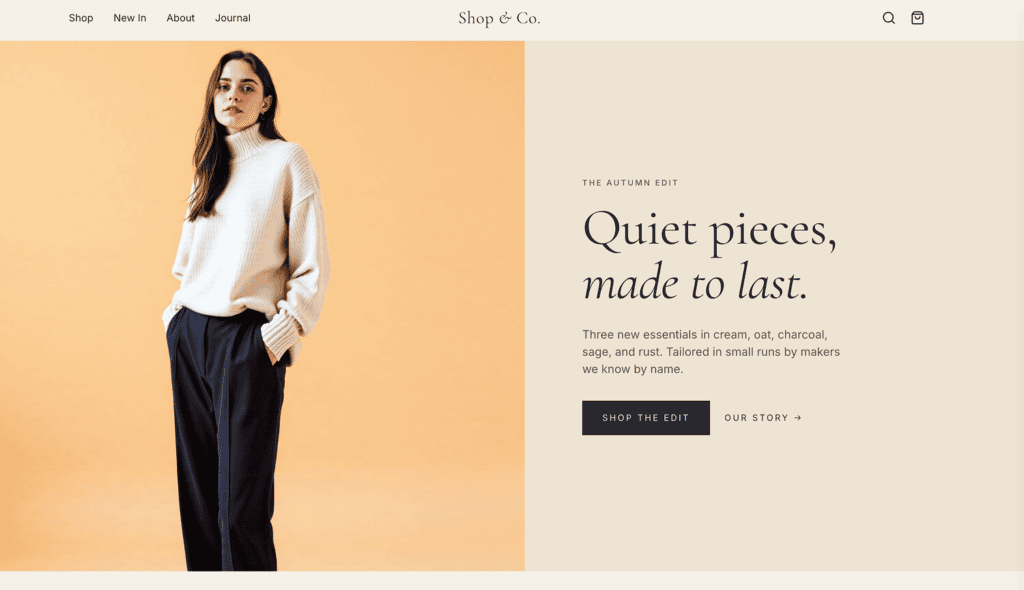
A minimalist women’s basics storefront built around three launch products in a muted color palette. The site includes a homepage with hero image, product grid, brand story, testimonials, newsletter signup, and footer; individual product pages with image galleries, size selectors, and add-to-cart; a cart and multi-step checkout.
The prompt: One paragraph describing the brand followed by a bullet list of desired features. Brand colors were specified by name. The newsletter popup, slide-out cart drawer, sale badges, low-stock indicators, Instagram feed, and sticky header were all requested. Minor corrections were made after the initial build but no further iteration followed.
Press here to read the full prompt.
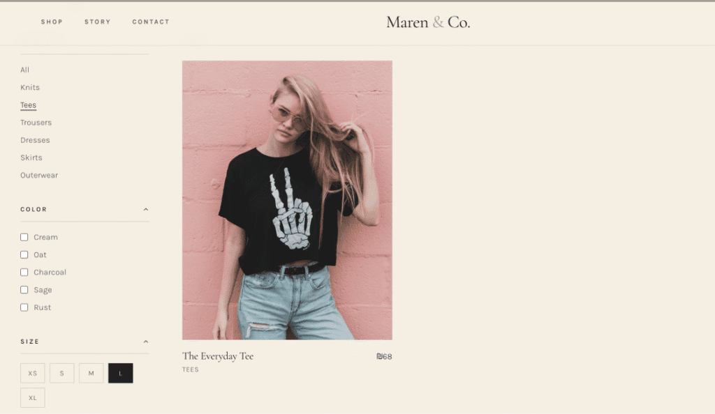
Maren & Co.

A more architecturally complete storefront with the same core feature set, expanded to include shop, about, and contact pages.
The prompt: A detailed brief specifying exact hex color codes, named typefaces (Cormorant Garamond and Karla), explicit aesthetic references (Reformation, Everlane), and a full multi-page architecture. The newsletter popup, a size guide modal on the product page, and an autoplay atelier video section were all explicitly requested. Multiple rounds of iteration followed — refining the hero, adding the size guide modal, adjusting the video section. Both the newsletter popup and the size guide modal appear in the audit findings.
What the audits found
Shop & Co.
Shop & Co returned 15 accessibility issues across a single page — 4 critical, 5 high, and 6 medium. Critical failures indicate content or functionality that is completely unusable for one or more groups of users with disabilities. On a homepage alone, Shop & Co had four of them.
The most significant cluster centers on the newsletter popup.
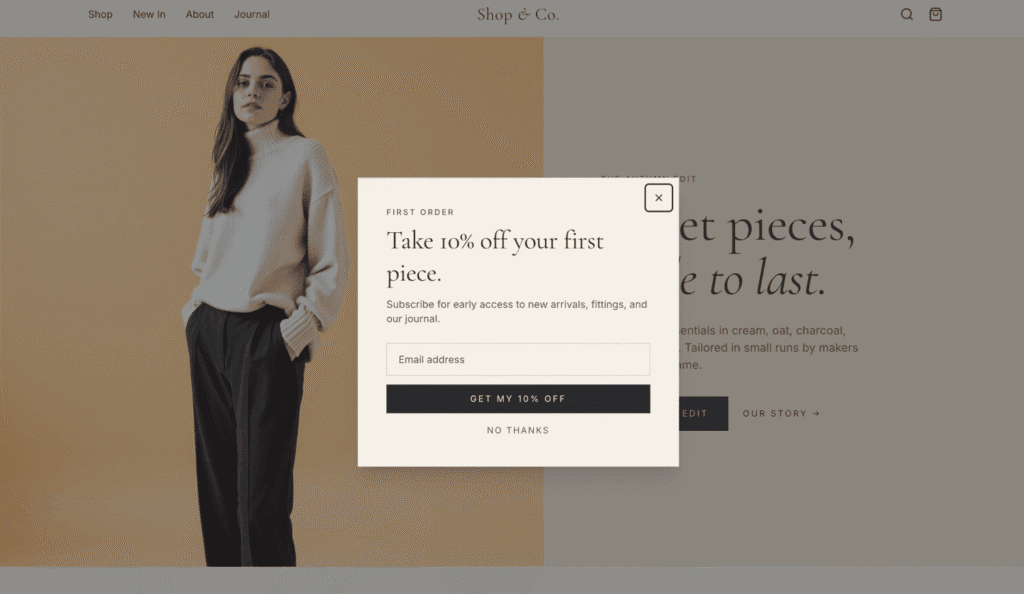
When the popup appears — a few seconds after the page loads, as requested — a screen reader user would have no way to know it had opened. The dialog has no ARIA role or accessible label, meaning assistive technology would have no way to identify it as a dialog at all. It would announce itself as a generic container with no context. Keyboard focus would remain on the page behind it, leaving the user with no path into the popup. Because focus is never trapped inside the dialog, a keyboard user who did reach it would not be able to navigate it properly.
The result is that the first thing a visitor would encounter on Shop & Co — the newsletter popup — would be effectively invisible to screen reader users and unnavigable for keyboard-only users. It is the first interactive element on the page, and it is completely inaccessible.
The cart drawer carries the same failures.
The slide-out cart drawer is built without an ARIA role or accessible label, and without the focus management that modal-like components require. When it opens, focus would remain on the page behind it. A screen reader user attempting to review their cart would have no indication the drawer had appeared.
Form inputs compound the picture.
Two email fields on the page — the newsletter signup in the popup and the subscription form in the footer — rely on placeholder text as their only label. When a screen reader user focused either field, the placeholder would disappear and no announcement would be made. The purpose of the field would not be communicated.
The expandable search field in the sticky header does not communicate its state to assistive technology.
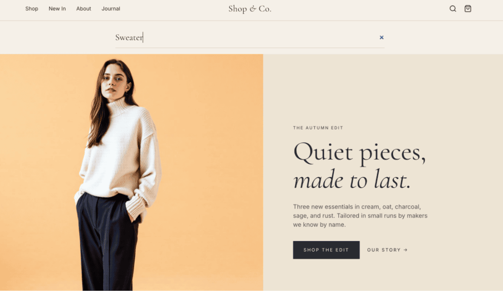
When a user activated the search control, the field would expand beneath the header. That expanded state would not be announced to screen readers, leaving users with no confirmation that anything had changed.
Six medium-severity issues round out the findings:
Four instances of text fail the minimum contrast ratio required by WCAG Level AA, meaning low-vision users would not be able to read them. And a product-specific failure with direct commercial consequences: sale prices and original prices are visually differentiated by color and strikethrough, but that distinction exists only in the visual presentation. A screen reader would read both figures as plain numbers with no indication of which represents the discounted price. A blind user browsing products would not be able to determine whether an item is on sale.
Maren & Co.
Maren & Co. returned 9 issues — 4 critical, 4 high, and 1 medium.
Fewer total issues than Shop & Co, but the same severity distribution at the top: four critical failures, all of them concentrated in a single feature the user explicitly requested.
The newsletter popup was built without any of the accessibility infrastructure a modal requires
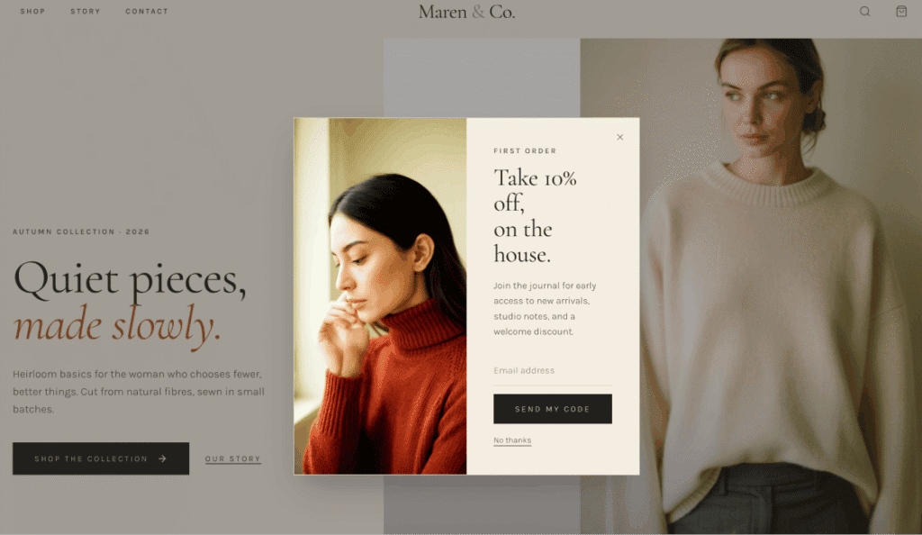
The prompt included instructions for a newsletter popup offering 10% off. Lovable built it. What it did not build was the semantic markup, focus management, or keyboard behavior that makes a modal usable for screen reader and keyboard users. The dialog has no ARIA role and no accessible label — a screen reader would encounter it with no context for what it is. When the popup opened, keyboard focus would remain on the page behind it. When the modal closed, focus would not be returned to a logical position on the page, leaving users who were navigating sequentially without a clear point of return.
The size guide modal — also explicitly requested — carries the same failures.
The user asked for a size guide modal on the product page. It was built with no ARIA role, no accessible label, and no focus management. A screen reader user who activated the size guide link would have no indication that a modal had opened.
Three input fields across the page rely on placeholder text as their only label.
The newsletter popup email field, the newsletter section email field, and the search field all use placeholder text that disappears on focus. A screen reader user would receive no announcement of what the field was for. One medium issue rounds out the findings: the sale badge text fails the minimum contrast ratio, meaning low-vision users would not be able to read it.
What both sites tell us
The simple prompt produced 15 issues. The detailed, iterated prompt produced 9. On the surface, that looks like evidence that a better brief leads to a more accessible site. It isn’t.
The expert prompt didn’t produce fewer critical failures — it produced the same number.
What it produced fewer of was lower-severity issues, largely because a more considered design brief resulted in a cleaner, less cluttered page. But the structural accessibility failures that matter most — unlabeled dialogs, broken focus management, inaccessible form inputs — are identical across both sites.
| Failure type | Shop & Co. | Maren & Co. |
|---|---|---|
| Dialog without ARIA role or label |  | |
| Focus not moved into modal on open | | |
| Input fields without accessible labels | | |
| Focus not trapped inside modal | | |
| Sale text contrast failure | | |
The prompt correspondence for Maren & Co. included a request for the newsletter popup and the size guide modal. Both were built exactly as requested — visually functional, professionally presented. Neither was built with the semantic markup, focus management, or keyboard behavior that accessibility requires. Specifying a feature in detail does not change what the platform delivers at the code level.
Bottom line: The quality of the prompt didn’t close the accessibility gap. In some ways, it widened it.
What happens when you explicitly prompt for accessibility
A reasonable assumption is that explicitly requesting accessibility in the prompt would produce a more accessible result. Independent real-world testing suggests otherwise.
In a separate test conducted outside this research, an ecommerce site was built using an AI-powered site generation platform with accessibility explicitly stated as a priority in the prompt. The platform’s built-in automated accessibility tool returned a score of 100%.
When a screen reader user navigated the live site, the following failures were documented:
- Modals and menus leaked focus — the screen reader read content behind open overlays rather than within them
- Page transitions failed to manage focus — users landed mid-page, missing content above
- The navigation menu button provided no indication of whether it was expanded or collapsed
- Heading levels were skipped, jumping from H1 directly to H3
- A button’s visible label and accessible name didn’t match, breaking voice control navigation
- The language switcher announced only “en button” and “sv button” with no indication of which was selected
The automated tool returned a passing score on all of these. The screen reader user encountered each of them in practice.
The finding is consistent with what the audits in this report surface: explicit prompting for accessibility does not change what the platform generates at the code level. It changes the stated intent. The output is determined by platform defaults — and on that measure, intent is not sufficient.
What this means for ecommerce brands building with AI
AI-powered site generation platforms have earned their place in ecommerce. The ability to move from brief to fully functional storefront in hours is a genuine capability shift — and one that will only become more powerful as these tools develop. The recommendation here is not to avoid them.
What these audits demonstrate is that accessibility is not part of what they deliver by default.
The visual output is professional. The underlying code structure that assistive technology depends on is not being generated to the same standard. For ecommerce brands — already the most-sued sector for digital accessibility — that gap carries real consequences.
Building with AI and building accessibly are not mutually exclusive. But closing the gap between them requires deliberate action: understanding where the defaults fall short, layering in the accessibility infrastructure these platforms don’t provide, and auditing the output before and after it reaches customers.
As a starting point, we encourage you to run a free accessibility scan of your website with accessScan.
It’ll give you a clear picture of where your site stands before those gaps become something harder to address.
Frequently asked questions
What did accessiBe's audit of AI-built ecommerce storefronts find?
Two ecommerce storefronts, built independently on an AI site generation platform, were audited against WCAG 2.2 AA standards. Combined, the audits surfaced 24 accessibility issues, including 8 critical failures — problems severe enough to make content or functionality completely unusable for some users with disabilities. Both sites failed in nearly identical ways, despite being built from very different prompts.
Does a more detailed prompt produce a more accessible site?
Not in any way that matters most. The site built from a simple prompt returned 15 issues; the site built from a detailed, iterated prompt returned 9. But both had the same four critical failures. A better brief reduced clutter and lower-severity issues — it didn’t touch the structural problems, like unlabeled dialogs and broken focus management, that make a site unusable for screen reader and keyboard users.
What were the most common critical failures across both sites?
The newsletter popups on both storefronts had no ARIA role or accessible label, so screen readers couldn’t identify them as dialogs at all. Neither trapped keyboard focus inside the popup when it opened, and neither returned focus to a logical spot when it closed. The same pattern showed up in Shop & Co’s cart drawer and Maren & Co size guide modal — both explicitly requested features, both missing the semantic markup and focus management that make them usable.
If I explicitly ask an AI platform to prioritize accessibility, will it actually build an accessible site?
Independent testing referenced in this report suggests not reliably. A separate site built with accessibility explicitly stated as a priority scored 100% on the platform’s built-in automated accessibility check — yet real screen reader testing found the same class of problems: leaked focus, skipped heading levels, unlabeled navigation controls, and mismatched button labels. Stating an intent in a prompt doesn’t change what the underlying platform generates at the code level.
Can an automated accessibility score be trusted?
Not on its own. In the cases this report examines, sites that passed automated scans with high or perfect scores still failed basic screen reader and keyboard navigation testing. Automated tools are useful for catching certain classes of issues, but they can’t evaluate lived experience — whether a screen reader user can actually find, understand, and operate a dialog, form, or menu. That gap is why manual testing by people using assistive technology remains essential.
Should ecommerce brands avoid AI site generation platforms because of this?
No — the recommendation isn’t to avoid these tools, which offer a real and valuable capability shift for building storefronts quickly. The takeaway is that accessibility isn’t part of what they deliver by default, so it has to be added deliberately: understanding where the platform’s defaults fall short, layering in the accessibility infrastructure it doesn’t provide, and auditing the output — both before and after it reaches customers.
Supporting you every step of the way
Schedule a one-on-one demo with an accessibility expert, to find a plan tailored to your company’s needs
