If you are a business or organization registered in Ontario, Canada, you more than likely need to comply with the Accessibility for Ontarians with Disabilities Act (AODA).
Under the AODA, websites and web-based content (such as online documents) need to conform to specific style and structure guidelines. These provide instructions on various design elements, including fonts.
In this blog, we will explore how you should go about selecting fonts when attempting to comply with the AODA.
We will showcase font styles and families that can be used on your website and online documents, and point to fonts that should be avoided, so that you are truly welcoming to the disability community.
Important note: To assist in your internal documentation and ensure your font choices meet these legal standards, you can use the W3C Accessibility Evaluation Report Template to track and record your website’s conformance results. This is particularly useful for the upcoming mandatory December 31, 2026 compliance report required for all Ontario organizations with 20 or more employees.
Fonts to use for AODA compliance
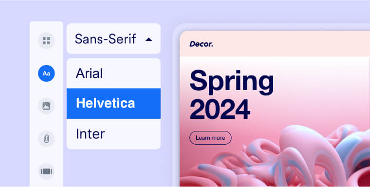
- Verdana
- Helvetica
- Calibri
- Tahoma
- Century Gothic
- Arial
The AODA at a glance
The Accessibility for Ontarians with Disabilities Act (AODA) is a provincial legislation in Ontario, Canada that aims to improve accessibility for individuals with disabilities within the province of Ontario.
The law includes standards and requirements for Ontario-registered organizations and businesses aimed at creating accessible environments and providing equal opportunities to the disability community. The AODA applies to all levels of government, private and non-profit organizations, and businesses operating in Ontario.
One of the core tenets of the AODA is ensuring that the disability community has equal access to websites and web-based content.
To that end, the AODA points to the Web Content Accessibility Guidelines (WCAG) 2.0 as the standard by which websites must conform to under the law.
Developed by the World Wide Web Consortium (W3C), WCAG is considered by many to be the most influential set of guidelines impacting global web accessibility policy.
While there are three different levels of WCAG conformance (i.e., Level A, Level AA, and Level AAA), under the AODA, websites and online documents must conform to WCAG 2.0 Level AA.
WCAG’s application to fonts
The Web Content Accessibility Guidelines (WCAG) feature specific sections that provide guidance and instruction on the way web-based content should be presented. These can help you when attempting to understand which fonts you can and can’t use under the AODA.
The key WCAG sections pertaining to fonts are as follows:
- Ensuring content can be presented in various ways: When it comes to fonts, it is crucial to choose one that remains legible even when enlarged
- Enhancing visibility and audibility of web content: To that end, it is important to consider specific font families, font sizes, font spacing, and the way a font color contrasts with its background
We will expand on these principles and show how they apply to specific font families and categories next.
Selecting accessible fonts under the AODA
Fonts that fit WCAG’s requirements have this in common:
- Their design is simple
- Their letters and characters are easily distinguishable
- Their size and weight allow for comfortable reading
- They do not feature letters that mirror each other
- They have enough spacing between characters and lines
- They aren’t decorative or italicized
- They sufficiently contrast with their background color
Let’s look closer at accessible font families, and check how color and size impact font accessibility.
How to choose an accessible font family
With thousands of font families, it is critical to choose one that can be read by the highest number of readers. However, before zeroing in on an actual font family, it is first important to consider a font’s typeface.
Serif fonts, characterized by small lines or flourishes at the end of characters, are unique and visually appealing. They can also be challenging to read for people with vision impairments.
Conversely, sans-serif fonts are characterized for their clear, straightforward lines and high legibility, and are often considered more accessible to a wider range of readers. However, the idea that every kind of serif font isn’t accessible has been debunked, and there are some sans-serif fonts that also aren’t accessible.
It is therefore critical to test a specific font family for accessibility before selecting it.
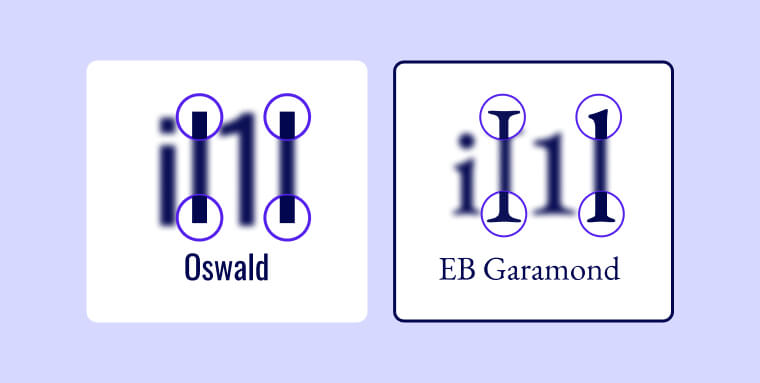
A good place to start is by examining how easy it is to distinguish between certain letter and number pairings within a font family.
For example, some fonts can make it very difficult for readers to distinguish between the lowercase “i”, uppercase “i”, uppercase “L”, and numeral “1”. In the following example, the uppercase “i” and the lowercase “L” are virtually identical when appearing in the Oswald font.
Conversely, there is a big difference between the two characters when appearing in EB Garamond. The uppercase “i” in the EB Garamond font has a wider and thinner base than the lowercase “L”. Additionally, the top of the uppercase “i” is a flat line, whereas the lowercase “L”’s top slants.
Another issue you should consider is “mirrored” typography.
For instance, in certain fonts, the lowercase letters “q” and “p”, along with the lowercase “d” and “b” can look very similar when mirrored. It is therefore important to choose a font family in which these two letters are easily distinguishable.
As a general rule, it is best to follow Google’s recommendation and inspect the following character and lettering pairs within a font family to ensure they are sufficiently distinct from each other:
- nu
- il1I
- 0O
- qp
- db
- a8
- a6
- 6g
- rn, m
Size requirements for font accessibility
WCAG doesn’t specify which font sizes are accessible. However, there are some recommended tips you can take to make text more readable for people with vision impairments. A safe bet for a WCAG-conforming font size is 16px (or 1em or 1rem) at minimum. It is worth noting that this is the font size recommended by Google.
Here are some other aspects worth paying attention to:
Ensure that headers can be identified easily
Readers rely on headers to understand the hierarchy of content appearing on a web page or online document. People tend to skim through content, and headers help them identify sections that are more relevant and interesting to them.
Given that there are a number of header classes, it is important to select appropriate font sizes for different headings. H3 headers, for example, should be given a fixed font size that is larger than the one used for H4, and smaller than the one used for H2s.
Ensure adequate text spacing
Properly-spaced text is more legible and easier to read. WCAG includes specific requirements regarding spacing, which include:
- Ensuring line height is at least 1.5 times the font size
- Ensuring that the spacing following paragraphs is at least 2 times the font size
- Ensuring that spacing between letters is at least 0.12 times the font size
- Ensuring that spacing between words is at least 0.16 times the font size
It’s important to note that characters appearing in one font family can look more crowded when compared to another, even with the same level of spacing between words. To find the right spacing for specific fonts, you can use Google Fonts Type Tester.
Color contrast requirements for font accessibility
Whether a font’s color is accessible will be determined based on how it contrasts with its background. To conform to WCAG, font colors should have a contrast ratio of at least 4.5:1 with their background. For larger text (18pt or higher), a contrast ratio of at least 3:1 will suffice.
You can press here to learn more about selecting AODA-compliant colors.
Tips for choosing accessible fonts
Minimizing the number of fonts you use on your website and web-based applications will lead to a better overall user experience for all website visitors and users.
Additionally, it is worth trying to test specific font choices by asking people with disabilities to interact with them and provide feedback on them. This is especially beneficial when you know that there are a significant number of people with specific disabilities in your audience.
It is worth noting that even when you fully conform to WCAG, there will be website visitors who still struggle engaging with certain fonts and content sections. Luckily, there are ways to allow people to adjust fonts and other design elements themselves so they fit their unique needs and sensibilities.
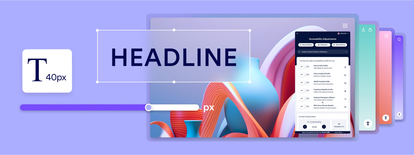
Using a web accessibility tool like accessWidget allows individual website visitors to enlarge font sizes, adjust color contrasts so that fonts become more visible, and even replace existing fonts with more readable ones.
Click here to read more about accessWidget and how it can help website visitors with disabilities.
Examples of accessible fonts
Even though it can be tempting, choosing a unique font for your website and online documents isn’t a recommended practice. The more recognizable fonts (and the kind found on many websites) tend to be the most readable, legible, and friendly for the highest number of readers. Some of the most popular accessible fonts are:
- Arial
- Calibri
- Century Gothic
- Garamond
- Helvetica
- Tahoma
- Verdana
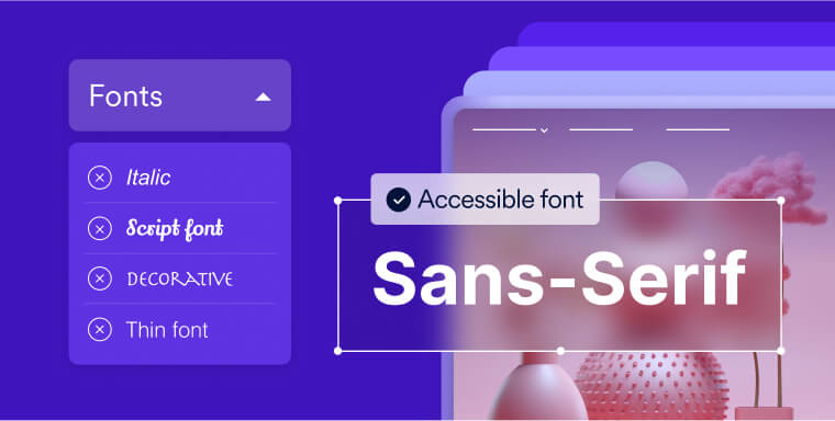
Fonts to avoid
The following fonts can often prove problematic for members of the disability community:
- Script fonts: Designed in a way that mimics cursive handwriting, script fonts’ letters are typically not distinct from each other. People with dyslexia, low vision, and some other disabilities will find them very hard to access
- Italic and oblique fonts: Fonts that feature italicized characters are very difficult for people with vision impairments to read
- Highly decorative fonts: Fonts with intricate designs and embellishments can present challenges for some readers, especially those with cognitive impairments
- Thin fonts: Condensed fonts, especially at smaller sizes, tend not to contrast sufficiently with their background
The importance of using accessible fonts
Using fonts that are accessible and highly readable is crucial for individuals with disabilities. Many members of the disability community, specifically those with vision impairments, simply cannot read and comprehend content that is presented via thin, decorative, and heavily italicized fonts.
However, presenting content via accessible fonts will be appreciated by readers outside the disability community, as well.
Many website visitors tend to skim through text instead of reading every word, especially when they are distracted, stressed, or multitasking. In such cases, content appearing in large, highly readable fonts can have a profound impact on readers’ comprehension and engagement levels.
It’s important to note that search engines like Google measure readability as a ranking factor. Given that fonts are deemed accessible based on their level of readability, featuring them on your website helps it rank higher in search engines.
Finally, the AODA is a provincial law enacted to protect members of the disability communities from discrimination.
Organizations that feature web-based content that cannot be accessed by certain people actively discriminate against them, and can face legal action for doing so. This can often prove time-consuming and costly, and can negatively impact your brand’s reputation.
Enhancing accessibility with readable fonts
To conform to WCAG 2.0 Level AA, and comply with the AODA, you need to ensure that you are using the right fonts on your website and online documents. The right font will allow the highest number of people, including those with vision impairments, to access your content, just like anyone else.
More simplistic and straightforward, accessible fonts are devoid of flourishes and unusual characteristics. Once you’ve selected a font, you should also pay attention to the way it contrasts with its background color, and ensure its size is large enough to allow for an optimal reading experience.
Frequently asked questions about AODA-compliant fonts
Q1. What does AODA require for accessible fonts?
A1. The AODA requires organizations to provide accessible digital content, and most font-related requirements come from following WCAG 2.0 Level AA.
Q2. Which font styles are considered most accessible?
A2. Clear, simple sans-serif fonts—such as Arial, Verdana, or Helvetica—are generally easier for many users to read, including those with low vision or cognitive disabilities.
Q3. Are decorative or script fonts acceptable under AODA?
A3. They can be used sparingly, but not for body copy or essential information, since they reduce readability and may not align with WCAG’s clarity and legibility recommendations.
Q4. Does font size affect AODA accessibility?
A4. Yes. Text must be large enough to read comfortably and support resizing up to 200% without losing content or functionality.
Q5. What about letter spacing and line height?
A5. Adequate spacing improves readability, and WCAG provides spacing ratios that help users who experience visual or cognitive processing challenges.
Q6. Do contrast levels matter for AODA compliance?
A6. Yes. Text must meet WCAG’s minimum contrast ratios so users with low vision or color blindness can read content clearly.
Q7. Are bold or italic text styles considered accessible?
A7. They’re accessible when used thoughtfully. Overuse of italics or very thin or ultra-light weights can reduce readability.
Q8. Do PDFs and documents need AODA-compliant fonts too?
A8. Yes. Public-facing PDFs, documents, and downloadable materials must follow AODA accessibility requirements and WCAG text guidelines.
Q9. How does accessiBe help organizations meet AODA accessibility expectations?
A9. accessiBe provides solutions that combine AI-driven remediation, automated scanning, manual audits, developer tools, and expert services. These offerings help organizations align with WCAG 2.0 and 2.1 Level AA text requirements and support ongoing AODA compliance efforts.