The financial world has moved almost entirely online, offering unprecedented speed and convenience. However, as fintech innovation accelerates, a critical gap has emerged: many of these digital tools are effectively off-limits to the one in four adults living with a disability.
This exclusion is most evident in how fintech handles data.
In an industry that thrives on “glanceable” insights, the reliance on purely visual charts and graphs creates a significant barrier for users with vision impairments.
When a platform’s most valuable information is locked inside an image that a screen reader cannot interpret, it doesn’t just hinder the user experience—it prevents financial independence.
In this blog, we’ll explore how to transform dense financial data into inclusive experiences that foster autonomy and support your compliance efforts.
The problem: When “visual-first” design blocks financial independence
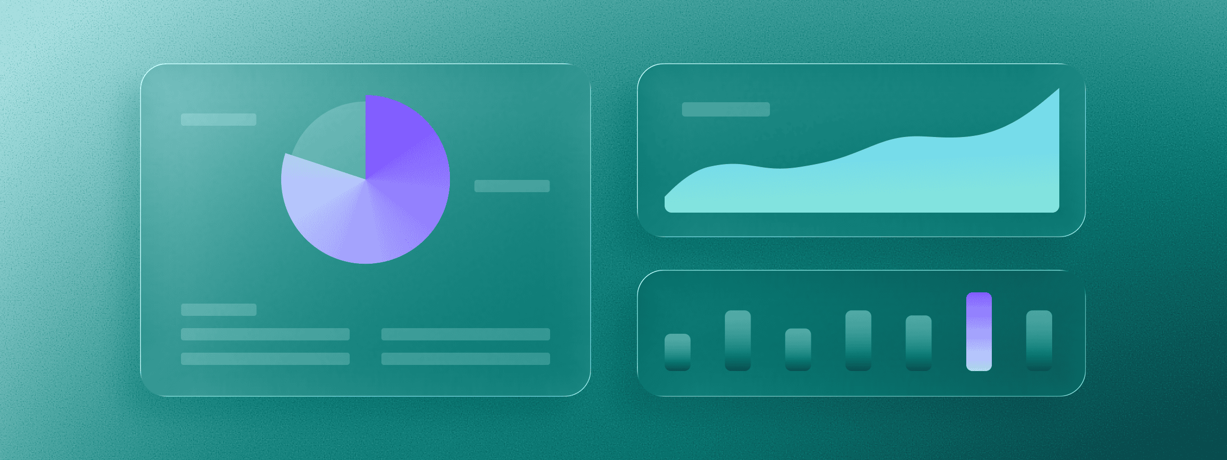
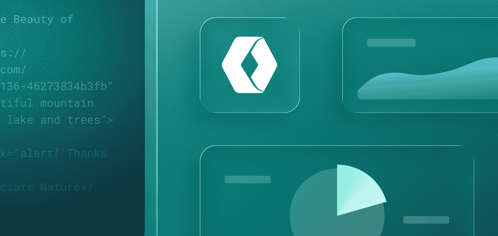
To stay competitive, fintech developers often focus on creating “visual-first” dashboards. It is common practice to break down complex financial data using colorful line charts, pie graphs, and real-time tickers.
While these tools help many users understand their spending or investments at a glance, they often leave out those with vision impairments.
For the millions of people living with vision loss—including the approximately 12 million adults in the U.S. age 40 and older who have vision impairment—a chart without a text-based alternative is essentially a blank space.
If a person cannot see the exact numbers in their portfolio or understand why a stock price is changing, they cannot manage their own money with the same autonomy as everyone else. This isn’t just a minor design flaw; it is a barrier to true financial equality.
Why alt text isn’t always enough
Standard alternative text (alt text) is the primary means of making images readable for screen readers. However, for the dense data used in fintech, a simple description like “line chart of stock growth” is often insufficient. High-stakes financial data requires more than a summary; it requires the ability to compare specific data points and identify precise trends. Because alt text is limited in length and detail, it often fails to convey the “raw data” necessary for an investor to make an informed decision.
Understanding the legal requirements for inclusive finance
While the ethical reasons for accessibility are clear, it’s important to realize that financial institutions are also legally mandated to provide equal access under the Americans with Disabilities Act (ADA). Because banking and money management are essential for daily life, digital platforms are considered “places of public accommodation,” meaning they must be accessible to everyone.
Furthermore, with the European Accessibility Act (EAA) having taken effect on June 28, 2025, many banking and financial services are now required to meet strict accessibility standards. Providing accessible data is no longer a future goal for firms operating globally—it is a current legal requirement.
Failing to address these barriers creates a significant legal and business risk. To help mitigate this risk and stay in compliance with the law, fintech firms must ensure their digital environments conform to the Web Content Accessibility Guidelines (WCAG).
The solution: turning complex charts into readable data
So, what can fintech platforms do to bridge the inclusion gap? True accessibility in data visualization requires moving beyond static summaries and toward interactive, structured alternatives that convey every data point accurately.
Implement ARIA-described tables and sonification for multi-sensory data
A simple text description isn’t enough for financial data. By using ARIA-described tables—which are data tables hidden in the code that match a chart—you give screen reader users a roadmap. They can move through the data one point at a time, letting them compare numbers just like someone looking at a graph.
To take inclusion further, companies can leverage data sonification. This technology uses different sounds and pitches to represent market trends. For example, a rising stock price might sound like a rising musical note. This helps users with vision impairments “hear” how the market is doing in real-time, providing an intuitive experience that text alone can’t match.
Use patterns and icons to move beyond color-only indicators
In many apps, green means “profit” and red means “loss.” But for people who are colorblind, these can look the same. To be inclusive, platforms should use distinct line patterns (like dots versus dashes) and clear icons (like plus or minus signs). This ensures everyone can see their financial status, regardless of how they perceive color.
Provide interactive data exploration via keyboard
Many modern charts allow users to “hover” to see specific values. For accessibility, these interaction points must be keyboard-focusable. Developers should ensure that a user can “tab” through each data point on a graph and receive a clear label (via ARIA-live regions) explaining the value at that specific point in time. This provides the same “deep dive” capability to assistive technology users as it does to mouse users.
Offer “view as table” toggles
One of the most effective ways to make data accessible is to offer a visible “view as table” toggle next to every chart. This not only helps screen reader users but also assists people with cognitive disabilities who may find a structured list of numbers easier to process than a complex, multi-colored visual.
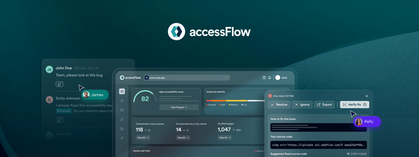
Building accessible fintech environments with accessFlow
Creating these complex, accessible environments requires a shift in how development teams work. This is where accessFlow, accessiBe’s accessibility management platform for developers, becomes an essential part of the fintech dev stack.
By using accessFlow, teams can move away from manual “patchwork” fixes and toward a sustainable, “shift-left” approach where accessibility is built into the product from the start:
- Audit and monitor dynamic data: accessFlow continuously monitors your code, alerting you if a chart update breaks the ARIA landmarks or keyboard navigation required to make that data readable for assistive technology.
- IDE-level remediation for complex dashboards: Through the Model Context Protocol (MCP), developers receive code-level fix suggestions directly in their IDE. This is critical for managing the precise ARIA attributes and roles needed to turn multi-layered dashboards into navigable information.
- CI/CD regression testing for transaction flows: The accessFlow SDK acts as a gatekeeper in your pipeline. It ensures that any new code updates to your “move money” or “trade” workflows don’t introduce new accessibility barriers before they ever reach production.
The future of inclusive finance starts now
Prioritizing accessibility is a strategic growth lever for any modern fintech firm. By mastering these technical hurdles, you aren’t just meeting regulatory requirements; you are creating a platform that welcomes everyone, including the one in four adults with disabilities who control a massive amount of global spending power.
Building with inclusion at the core helps you mitigate legal risk and build lasting brand trust. As the digital landscape evolves, the companies that lead in accessibility will be the ones that truly level the digital playing field for all.
Press here to learn more about how accessFlow can support your accessibility needs.