If you are a government agency, a federally-funded organization, or a service provider to such organizations, you need to comply with Section 508 of the Rehabilitation Act. Under the law, you need to ensure that your website, along with other information and communication technology (ICT), can be properly accessed by members of the disability community.
To that end, you will need to ensure that your website, online documents, emails, and software incorporate colors that contrast sufficiently, to allow people with specific vision impairments to properly access information conveyed within them.
But what color combination or color scheme conforms are considered accessible under Section 508?
In this blog, we will cover everything you need to know about Section 508-compliant colors. We will demonstrate why choosing the right color combination is so important, and what you should expect if your website and other ICT products are found to feature color schemes and contrasts that are inaccessible. Of course, we will also show you how to choose Section 508-compliant colors, and highlight those you should avoid.
- To comply with the Section 508 of the Rehabilitation Act, you need to ensure your website and other information and communication technology (ICT) conform to the Web Content Accessibility Guidelines (WCAG) at Level AA
- Conforming to WCAG at this level requires meeting a number of design-based criteria, that include ensuring proper color contrasts
- These pertain to meaningful and text and their background, along with meaningful icons and their backgrounds
- Certain color combinations will prove problematic in ensuring the proper contrast requirements, while others allow for optimal readability and accessibility
Section 508-compliant colors: an overview
Section 508 of the Rehabilitation Act was enacted to ensure equal access to information and communication technology for individuals with disabilities. Under the law, federal agencies, organizations receiving federal funding, and service providers to such organizations must make their information and communication technology (ICT) accessible to people with disabilities. A broad term encompassing a variety of platforms and applications, ICT includes websites, online documents, emails, and software.
Under Section 508, relevant bodies must ensure their ICT conforms to specific web accessibility guidelines called the Web Content Accessibility Guidelines (WCAG). Created by the World Wide Web Consortium (W3C), WCAG has a deciding impact on the way global web accessibility policy is being shaped.
While there are a number of WCAG versions, under Section 508, information and communication technology must conform to WCAG 2.0, an earlier version of these guidelines, at Level AA.
WCAG’s role in choosing Section 508-compliant colors
To understand what colors can and should be used within websites and other ICT under Section 508, relevant organizations need to adhere to the sections of WCAG that apply to color contrasts. For the most part, these sections touch on:
- Ensuring text and its background have an appropriate color contrast
- Selecting an appropriate color contrast between significant non-text elements and their background
- Not relying solely on color to convey information, prompt actions, elicit responses, or distinguish visual elements
- Ensuring that information conveyed via color is complemented by text, patterns, or visual cues
- Ensuring sufficient color contrast for graphic elements like charts and maps
Section 508-compliant colors: a deep dive
To ensure you are selecting color combinations that conform to Section 508’s standard of WCAG 2.0 Level AA — Section 508’s standard level of compliance — you should consider the following:
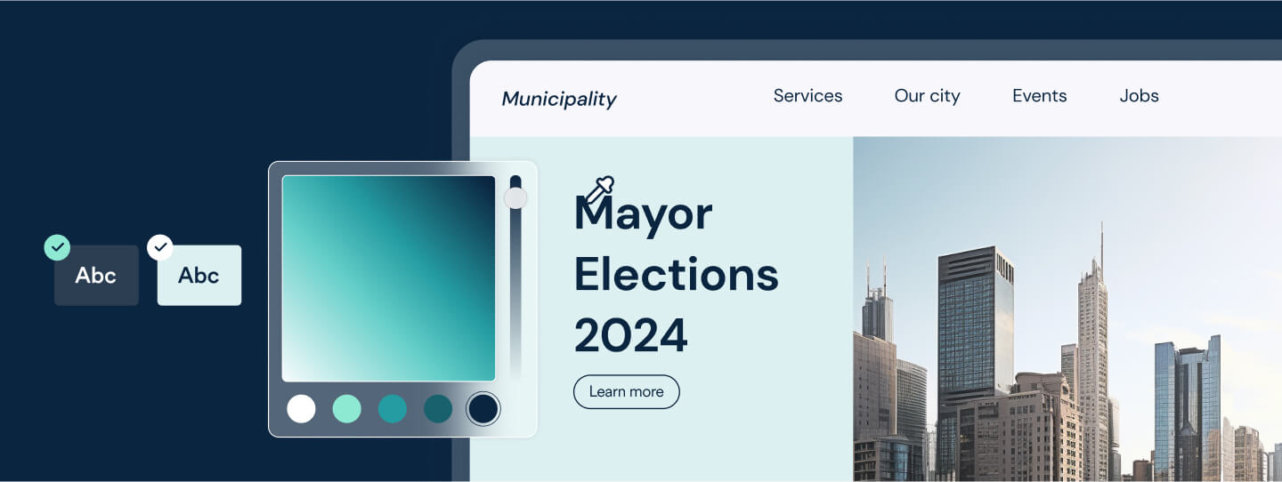
Choose the right color combinations
Even if many of us find certain color combinations striking and original, it is critical to remember that people with certain vision impairments will not. Often, these aesthetic choices will stand in the way of their ability to properly consume and understand vital information appearing within a website and other ICT.
Therefore, it is important to avoid color combinations that are close in hue, saturation, or brightness. Additionally, as they can overwhelm people with neurological impairments such as epilepsy, color combinations that are too bright or too saturated need to be avoided, as well.
But what color combinations should you consider using under Section 508?
You should consider the following:
- Black and white: The most highly contrasting (and thus, the most accessible) color combination out there. Despite what you may think, websites (and other relevant ICT) that rely on black and white color schemes can be visually stimulating, providing an engaging aesthetic experience to everyone
- Red and white: The right shades of red contrast well against white backgrounds, creating a stimulating and accessible aesthetic
It’s important to note, however, that there are shades of red that do not sufficiently contrast with a white background - Yellow and blue: Darker shades of yellow and blue are far enough away on the color spectrum to properly contrast, and can be leveraged to create an accessible, visually pleasing website. Important note: Certain shades of yellow and blue do not sufficiently contrast
- Green and white: Green and white color combinations can be both aesthetically pleasing and highly accessible. Important note: Some shades of green do not sufficiently contrast with white backgrounds
Color combinations to avoid
Some color combinations often do not contrast sufficiently, and can prove problematic for design purposes. If you are keen on incorporating these combinations, you will need to test specific shades to determine whether they properly contrast. These include, but are not limited to:
- Green and blue
- Blue and black
- Blue and purple
- Red and brown
- Red and green
- Yellow and orange
- Yellow and red
- Yellow and green
- Purple and black
Ensure that text is readable
Highly contrasting color combinations play a critical role in ensuring the text appearing within your website and other ICT is sufficiently readable. Under WCAG 2.0 Level AA, text must have a contrast ratio of at least 4.5:1 with its background. A ratio of 3:1 is sufficient for large text (18-point) or 14-point bold text.
Here’s an example of a web page that features the required contrast ratios:
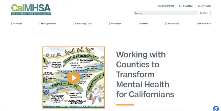
On CalMHSA’s homepage, the contrast between text and background is as high as 5.07:1 on this web page.
You can read more about this and the other requirements you will need to meet to achieve Section 508 compliance in our comprehensive Section 508 compliance checklist.
Ensure meaningful icons, checkboxes, and other functional graphics appear with proper color contrast ratios
The color contrast requirements detailed in WCAG need to be applied to all meaningful information displayed on your website or other ICT, including text-based information, and other forms of visual information.
Visual information is a broader category, which consists of meaningful icons, interface components, and other graphical objects that are pivotal for understanding content or functionality appearing within a website or other ICT product.
Examples of meaningful icons include, but aren’t limited to:
- The envelope icon representing email or messages
- The calendar icon symbolizing events or scheduling
- The gear or settings icon denoting customization or preferences
- The speech bubble icon indicating comments or conversations
The colors used for all the graphics mentioned above will need to properly contrast with adjacent colors, under WCAG. It’s important to note that this contrast needs to remain intact even when the icon is engaged with (i.e., hovered over or focused).
How can I test whether I’m using Section 508-compliant colors?
Using a color accessibility checker is necessary to help you with color selection and ensure text contrasts sufficiently with its background.
Tools that can help with your color selection include:
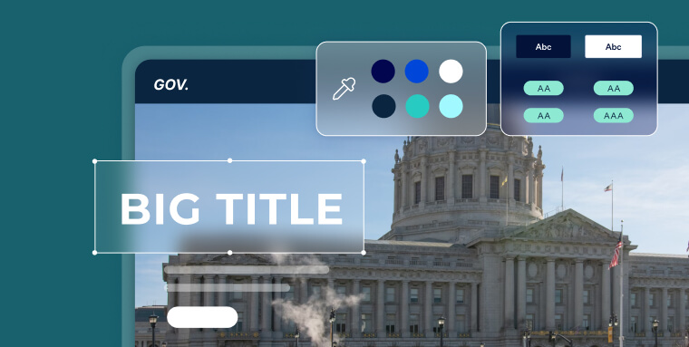
- ColorPick Eyedropper is a Google Chrome extension that helps you determine the precise color values of text and images on web pages. By hovering over elements, it provides real-time color information, facilitating accurate color selection and enhancing visual design choices
- Adobe Color Contrast Analyzer enables users to input color values or upload screenshots for a quick assessment of contrast ratios. It helps identify contrasts between different areas within images, allowing for improved visual accessibility and ensuring content is easily readable
- WebAIM Color Contrast Checker is a free online tool you can use to determine the contrast between text and background colors on a given website
- NoCoffee Vision Simulator is a browser extension (available for Google Chrome and Firefox) that allows you to simulate various vision impairments. By using this tool, you can gain insights into how your content appears to people with different visual abilities, aiding in designing more inclusive experiences
Section-compliant colors: other areas to look out for

- Section 508-compliant colors within online documents: Under Section 508, electronic documents need to be configured so that they can be accessed by people with disabilities. For them to be considered compliant, PDFs, Microsoft Office documents (such as Word documents), and any other online document formats need to meet a number of requirements. Most notable of these is ensuring elements are properly tagged to allow for screen reader usage. Additionally, online documents will need to feature sufficiently contrasting colors. It is important to keep this in mind when designing your online documents
- Accessible colors within other ICT products: As mentioned above, Section 508 applies to websites and many other forms of information and communication technology (ICT). The latter includes, but isn’t limited to, email, video conferencing tools, and various other software. The color contrast ratio requirements under WCAG 2.0 Level AA apply to these tools and platforms. You therefore need to ensure that the colors incorporated within them conform to these WCAG sections in order to achieve Section 508 compliance
Section 508 compliance: more than just choosing the right colors
Choosing the right color combinations and schemes is an important step toward ensuring your website is Section 508-compliant. However, it is only one part of a longer list of elements you will need to examine to determine whether your website fully complies with the law.
To gain a true understanding of whether your website is Section 508-compliant, you can use automated testing tools, like accessScan.
A free Section 508 website compliance testing tool, accessScan will run a quick, automated audit of your website and examine its level of conformance to WCAG 2.1 Level AA.
After checking your web page’s various relevant elements (including color contrasts and combinations), accessScan will assign your website a score: Accessible or non-compliant. Additionally, you will also be presented with a more detailed breakdown of your website’s compliance status. This report can be downloaded as a PDF and will include instructions on how to address and fix compliance issues found during the test.

Why using Section 508-compliant colors is important
Far too often, members of the disability community are denied the opportunity to engage with digital environments that are presented to others. Selecting Section 508-compliant colors is an important step toward ending this ongoing discrimination, ensuring that ICT products are as accessible to people with certain disabilities as they are to anyone else. Government-funded organizations should assume a prominent role in promoting the rights of the disability community, and should set the standard on digital inclusivity.
Selecting color schemes with clear contrasts also contributes to a website’s overall readability. This is not only a central aspect of good, effective web design, but it can also improve your website’s chances of ranking in search engines.
It’s important to note that Section 508 is a federal law. Organizations that must comply with it and fail to do so discriminate against people with disabilities, and can face legal recourse for doing so. This includes facing lawsuits, which can have significant negative ramifications for your organization’s reputation.
Frequently asked questions about Section 508-compliant colors
Q1. What makes a color scheme “Section 508-compliant”?
A1. For ICT (websites, documents, software) under Section 508, color use must conform to relevant Web Content Accessibility Guidelines (WCAG) criteria—meaning adequate contrast ratios (minimum 4.5:1 for normal text), and no reliance solely on color to convey meaning or actions.
Q2. What contrast ratio requirements apply?
A2. Normal body text must contrast with its background at or above about 4.5 :1. Large text (bold 14pt+ or 18pt+ normal) must meet about 3:1. These thresholds help ensure readability for people with low vision or color-sensitivity.
Q3. Why is it forbidden to rely solely on color to convey meaning?
A3. If something is indicated only by color—say, red text means “error”—users who cannot perceive the difference may miss the message entirely. Section 508 requires that color not be the only visual cue; additional cues like text labels, shapes or patterns must accompany it.
Q4. What are common problematic color combinations?
A4. Combinations close in hue or brightness—like green on blue, yellow on white, red on brown—often fail contrast tests or are indistinguishable for many users. Even when they “look nice,” they may not yield accessibility conformance.
Q5. How can I test whether my color palette meets Section 508 standards?
A5. Start with automated contrast checkers to verify numeric ratios for text and background. Then test in real-world conditions—simulate color-blindness, low light, different devices, and evaluate whether icons, charts and UI components remain distinguishable and usable.
Q6. Do Section 508 color requirements apply only to text?
A6. No. They apply to any meaningful visual content: text, icons, buttons, interactive elements, charts and graphs. Visual elements that convey information must meet contrast and non-color-only rules so that all users can understand and use them.
Q7. Why is accessiBe a strong solution when dealing with color accessibility issues?
A7. accessiBe offers end-to-end accessibility solutions that help identify color-contrast violations, ensure visual elements meet accessibility criteria, and monitor changes over time. With the best in AI and human expertise, accessiBe supports organizations in implementing compliant color schemes, maintaining visual usability and mitigating legal risk.