As people spend more time online, inclusive design has become more important than ever, as it ensures everyone can access information. Yet, according to WebAIM, a nonprofit at the Institute for Disability Research, Policy & Practice at Utah State University, as much as 95.9% of home pages are inaccessible to those with disabilities. Imagine living with a disability and being shut out of almost all of the information on the internet. This prospect becomes even more daunting as more of the world adopts digital technologies.
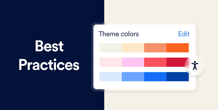
One common impairment, especially in men, is color vision deficiency, or the inability to distinguish certain color shades. Roughly 1 in 10 men are born with some form of color deficiency, according to the American Academy of Ophthalmology. Despite this prevalence, not all designers think carefully about their chosen colors. For instance, graphics commonly include color scales, which can sometimes be difficult to differentiate. A small amount of thoughtfulness can make a big difference when designing visuals that communicate ideas to audiences.
With that in mind, we’ve compiled a best practices guide for vision deficiency-friendly design, taking insights from design firms, professional designers, and colorblind accessibility resources.
What is color blindness?
Color blindness occurs when nerve cells in the eye, called cones, aren’t working correctly and cannot process light and images to help the brain recognize color. These cones are sensitive to certain colors like red, green, or blue because of the pigments inside them, but if a few pigments are missing, people become unable to distinguish all colors.
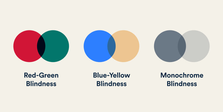
Very few people are completely color blind, so some refer to this condition as color vision deficiency. People with this condition often can’t distinguish red from green colors or, more severely, identify blue from yellow. Most people with this rarer condition also often cannot tell the difference between red and green.
Most cases of color vision deficiency are genetic and are passed down from parents. Because the genes that cause it are found on the X chromosome, men are more likely to have it. People assigned male at birth only need one parent to get the gene, while those assigned female at birth must have them from each parent. Intersex people have different X and Y chromosome combinations and would need all of their X chromosomes to have the gene for color deficiency to surface.
Color vision deficiency can also happen later in life due to disease or injuries, such as retinal detachment or glaucoma.
Designing for people who have color vision deficiency
There are several inclusive design principles to make websites accessible for people with color vision deficiencies.
The most basic is to avoid red-green color scales. Instead, try using different shades of the same color or patterns. Data visualization expert Andy Kirk suggests swapping out the red for a more pink color and the green for a more lime color.
Another way Kirk suggests to overcome the red-green color vision deficiency is to use helpful texts or symbols—in addition to the color coding—that can clue a reader in. This is known as redundant encoding and can be accomplished by labeling and using text to describe trends or highlight key elements. Similarly, icons or symbols can help convey what you mean.
In addition, many design programs and websites have color blind checkers (known as color accessibility checkers) or presets to see how different people will absorb the same image or graphic. Web browsers such as Chrome and Firefox have extensions that can help you simulate what a person with a color deficiency sees. Coblis is another website where you can upload images to check how those with color vision deficiencies see them.
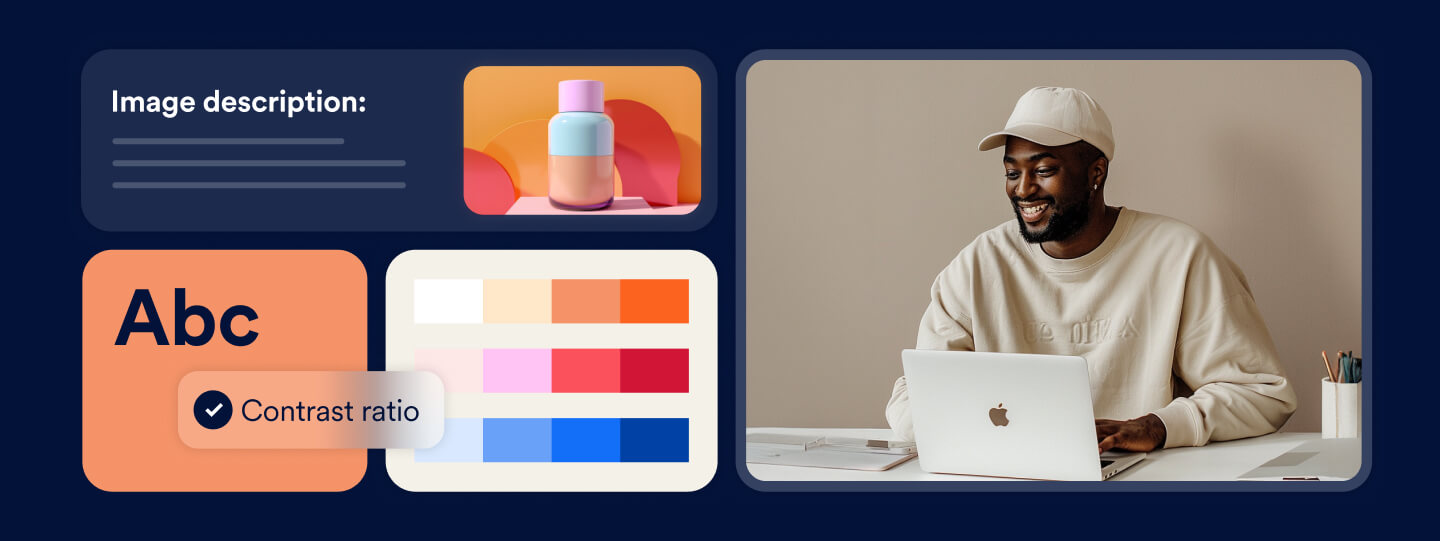
Alternative text should also be provided for those with low vision or other vision impairments. Simply called alt text, this text describes a photo or image separate from a photo caption. To help understand the text on screen, people with vision impairments also rely on screen readers that describe photos, graphs, and other images. However, these readers can only work properly if the alt text is set up correctly.
It is important to use alt text only for meaningful images or screenshots. Providing detailed alt text for images and graphics conveying critical information—rather than images that appear for decorative purposes only —will prevent people who use assistive technology from being needlessly confused.
A good rule of thumb is to use complete sentences that are brief but detailed. Rather than writing down “three people with city background,” consider typing, “Three professionals in business attire are walking with their suitcases while seemingly having a chat.” Rather than identifying an image as a picture, as in “image/picture of…,” go right ahead and describe the photo. Screen readers already identify images as such, so introducing them as photos becomes redundant. If the image in question is a screenshot, however, it is recommended to present it as such within the alt text.
These are some ways design can be more approachable for those with color vision deficiencies. No matter what step you take, designing for some usually opens the door even more.
As design leader Susan Goltsman said: “Inclusive design doesn’t mean you’re designing one thing for all people. You’re designing a diversity of ways to participate so that everyone has a sense of belonging.”
Frequently asked questions about accessible websites for people with color blindness
Q1. What is color blindness (or color vision deficiency) and how common is it?
A1. Color blindness is a condition where someone has difficulty distinguishing between certain colors—most commonly red and green, or blue and yellow. Globally, around 4–8% of men and about 0.5% of women are affected by some form of color vision deficiency.
Q2. Why is designing for color blindness important for websites?
A2. If your website uses color as the only means to convey information—such as error states in forms, navigation cues or interactive buttons—users with color blindness may miss key information. That not only excludes a segment of your audience, but also increases usability issues and compliance risk under accessibility standards.
Q3. What color-related accessibility guidelines should I follow?
A3. Key guidelines include: ensuring a minimum contrast ratio (for example WCAG recommends 4.5:1 for normal text), avoiding conveying meaning by color alone, adding shapes or text cues alongside color-coded elements, and using patterns or textures when color differentiation is unreliable.
Q4. What are common mistakes in UI design that affect people with color blindness?
A4. Common mistakes include: using red or green alone to indicate status (success/failure), low contrast text or icons, relying on subtle shade differences, charts or graphs that use only differing colors without labels, and interactive elements where color changes (e.g., hover states) are the only visual cue.
Q5. What practical design steps can improve color-blind accessibility on my website?
A5. Steps include: test your palette using color-blind simulators, ensure every interactive element has a visible focus and non-color cues, use clear labels and icons for statuses, ensure sufficient contrast ratios, apply semantic markup and alt text for images/graphics, and review forms, data visualisations and navigation for accessibility.
Q6. How does accessibility for color blindness link to broader legal and usability obligations?
A6. Many accessibility laws and guidelines reference standards like WCAG, which assert that color must not be the only way to convey information (WCAG 1.4.1 Use of Color). Poor color-blind accessibility not only degrades user experience but may also contribute to legal risk, exclusion of users, and reputational damage.
Q7. How can my organisation embed colour-blind friendly practices in workflows and content updates?
A7. Establish design system rules for contrast and color use, include color-blind simulation testing in your QA process, train designers and developers on accessible color strategies, document accessibility decisions, and audit new features for color-blind usability—reducing future barriers and technical debt.
Q8. How can accessiBe help improve accessibility for color blindness on websites?
A8. accessiBe offers tools and services that can scan your site for contrast and color-usage issues, identify areas where color is the only cue, and guide remediation. Their accessibility expertise helps you align with WCAG criteria, ensure inclusive visual design, and reduce risk while improving usability for people with color vision deficiencies.