16% of the world’s population has some form of disability.
Members of the various disability communities deserve equal access to websites and web-based applications, yet, too often, they are treated to inequitable online experiences.
Only about 3% of websites are fully accessible.
This reality can and should be changed.
With the right resources and tools, tweaking your existing website so that it is fully accessible, or creating an accessible website from scratch, is within reach for all businesses and website owners.
In this blog, we will show you what you’ll need to do to ensure your website conforms to relevant web accessibility standards so that it welcomes all visitors. We’ll provide you with a comprehensive checklist of action items that, with the right tools, will transform your website into a fully inclusive space; and into one that has a far more expansive audience.
For your convience, we’ve created a comprehensive checklist of action items you will need to address when adapting your website for accessibility. You can download it by pressing here.
Main steps to make your website accessible
What does having an accessible website mean?
On a conceptual level, an accessible website is one that offers members of the various disability communities equal access to information and a seamless user experience tailored to their individual abilities.
On a more technical level, a website will be considered accessible when it conforms to leading web accessibility guidelines, namely the Web Content Accessibility Guidelines (WCAG). Created and maintained by the World Wide Web Consortium (W3C), WCAG is the most prominent set of accessibility guidelines today, and heavily impacts and shapes global web accessibility policy.
There are a number of WCAG versions (2.0, 2.1, and 2.2), with each offering three levels of conformance: Level A, AA, and AAA.
To be considered accessible, your website should adhere to WCAG 2.1 or 2.2 at Level AA. Following the checklist items to follow will help you make significant progress toward reaching that goal.
We’ll break down WCAG in furthere detail later in the blog. To skip straight to that section, press here.
How to make your website accessible: A full breakdown
So, now that we’ve established that your website will be deemed accessible when it conforms to WCAG 2.0, 2.1, or 2.2 at Level AA, the next question is, how can you ensure your site reaches that level of conformance?
Achieving WCAG Level AA conformance entails meeting a number of design and technical criteria.
While the full list is quite lengthy, here are a few of the most important action items you will need to address:
- Allow for keyboard-only navigation
- Ensure full compatibility with assistive technology like screen readers
- Use highly contrasting colors
- Provide alt text for meaningful images
- Use proper heading structures
- Include captions and transcripts for videos
- Design accessible forms
- Maintain responsive and flexible design
- Avoid using color as the only means of conveying information
- Use descriptive URLs and link text
- Ensure consistent navigation
- Allow for content to be increased and decreased in size
- Try to avoid auto-replaying media
- Use simple and clear language
- Include an accessibility statement
- Ensure your website does not feature content that can induce seizures
- Make sure your online documents are accessible, as well
- Regularly update and maintain accessibility features
We will expand on each of these action items next. You can press on each individual item to skip straight to it.
Important note: While this list is fairly comprehensive, there are additional criteria that need to be met to reach conformance with WCAG at Level AA.
Allow for keyboard-only navigation
Implementing keyboard navigation involves ensuring that all interactive elements on a website can be accessed and operated using only the keyboard. This includes navigation menus, forms, and other interactive components. This functionality is critical for people with certain motor and cognitive impairments who rely solely on their keyboard to navigate a website.
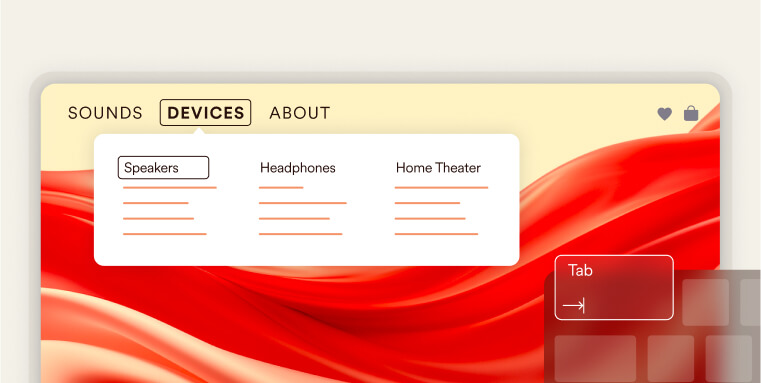
To ensure keyboard navigation, you must maintain a logical tab order. This means arranging the sequence in which interactive elements receive focus when a user navigates through the site using the “Tab” key on their keyboard. Following a natural reading order and arranging elements from top to bottom and left to right will mirror the way people read text, and will enable keyboard users to navigate the content in a predictable manner.
When users navigate a website using only the keyboard, it’s essential to provide them with a clear and visible indication of which element has the current focus. This is achieved through a focus indicator.
A focus indicator is a visual cue that highlights the currently focused element on a web page. The focus indicator typically appears as a visible outline, border, or change in background color around the focused element.
Some common interactive elements that should have a focus indicator include links, form fields, buttons, and other actionable items.
Developers should follow best practices in implementing focus indicators, making sure they are sufficiently visible and provide enough contrast for users to perceive them easily.
Another important element of keyboard navigation are skip-to links.
Skip-to links allows users to bypass redundant elements and navigate directly to core content, streamlining the browsing process.
Implementing skip-to links enables keyboard users to navigate web content more efficiently. Skip-to links are embedded at the outset of the HTML document. A hidden link, initially obscured from view, becomes visible when it gains focus through keyboard tabbing. The link is typically implemented as an anchor, strategically pointing to the primary content area of the web page.
Ensure full compatibility with assistive technology like screen readers
People with vision impairments such as blindness and low vision rely on assistive technology to access websites and other digital platforms. One of the most commonly relied-on tools are screen readers, such as JAWS and NVDA, which interpret and vocalize the content of web pages for users.
To ensure that screen readers can effectively translate and convey website content, various technical specifications must be met. One critical aspect is the implementation of Accessible Rich Internet Applications, or ARIA. ARIA consists of a set of HTML roles and attributes designed to make web content more accessible and understandable for users with disabilities.
For example, when a screen reader engages with a dropdown menu that lacks ARIA attributes, it may not announce the menu’s presence or state correctly (i.e., it won’t detail whether it’s open or collapsed). However, by adding the ‘aria-expanded’ attribute to the dropdown, developers enable the screen reader to inform users of the menu’s status. When ‘aria-expanded’ is set to ‘false’, it indicates that the menu is currently closed, but when changed to ‘true’, it signifies that the menu is open and its contents are available for navigation.
It is important to note that applying ARIA correctly and accurately can prove challenging. On top of that, ARIA shouldn’t be added to elements unnecessarily if semantic HTML can be used instead. Semantic HTML elements like <nav>, <button>, and <form> inherently convey their purpose and structure to assistive technologies without the need for additional ARIA attributes.
Both keyboard navigation and screen reader compatibility are the more challenging elements of creating an accessible website. Therefore, many website owners rely on web accessibility tools, like accessWidget, to help them with these tasks. Leveraging AI, accessWidget performs an automated audit of your website, flagging and then remediating areas that stand in the way of reaching full accessibility.
You can read more about accessWidget and how it can help you ensure your website is fully compatible with screen readers and can be navigated solely via keyboard by pressing here.
It is worth noting that other action items appearing later in this list are also critical for screen reader compatibility. These include, but are not limited to, implementing proper heading structures and opting for proper link text.
Use highly contrasting colors:
People with vision impairments, particularly individuals with certain forms of color blindness, find it difficult to access textual information when it appears in a color that does not sufficiently contrast with its background.
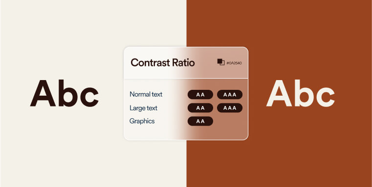
To conform with WCAG 2.0, 2.1, or 2.2 at Level AA, there needs to be a contrast ratio of at least 4.5:1 between text and its background, and a 3:1 ratio between titles and their background.
It is important to note that this applies to all meaningful information displayed on your website. This includes text-based information, along with other forms of visual information. The latter includes meaningful icons, interface components, and other graphical objects that are necessary for understanding content or functionality appearing within the website.
For more information on this topic, press here.
Provide alt text for meaningful images
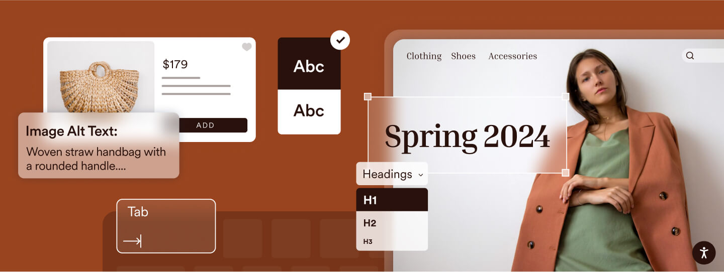
Alt text, short for alternative text, functions as a concise depiction of an image within the HTML code. Its primary purpose is to provide a textual substitute for individuals who may not be able to visually perceive the images, particularly those relying on screen readers. Therefore, it is crucial that alt text effectively communicates the crucial information or context contained within the image.
It is important to note that alt text should be added only to meaningful images.
Meaningful images are the kind that convey critical information, such as those depicting goods and services on eCommerce websites. Conversely, non-meaningful images (which are added purely for decorative purposes) should be hidden from assistive technology, and should not have alt text.
Ideally, alt text should be between 80 to 100 characters long. However, properly explaining the contents of a meaningful image takes precedence over this best practice.
The process of adding alt text to images varies depending on the CMS or website builder you use.
You can check out the following guides for more assistance:
- Adding alt text to meaningful images in WordPress
- Adding alt text to meaningful images in Shopify
- Adding alt text to meaningful images in WooCommerce
- Adding alt text to meaningful images in Wix
- Adding alt text to meaningful images in Webflow
- Adding alt text to meaningful images in Squarespace
- Adding alt text to meaningful images in Elementor
- Adding alt text to meaningful images in Divi
Use proper heading structures
Headings serve as crucial navigational aids, guiding website visitors through the content and helping them comprehend the hierarchy of information presented on a webpage. This is particularly beneficial for individuals with vision impairments who rely on screen readers to access digital content. A clear and logical heading structure ensures that users can easily navigate and understand the relationships between different sections of a webpage.
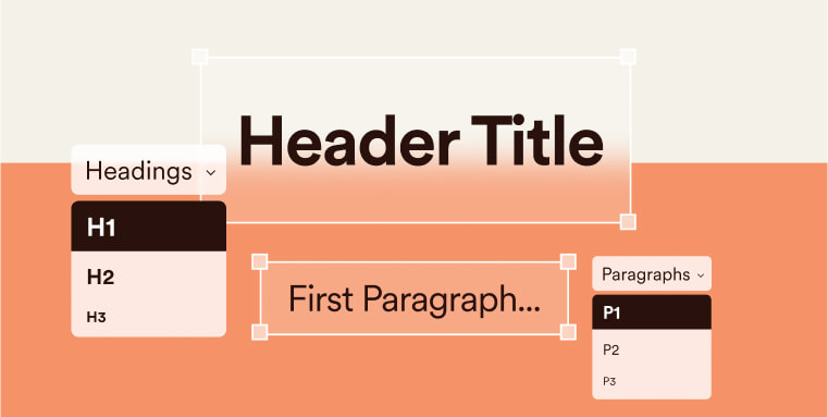
The heading structure should begin with a H1 tag, used once to define the main topic. This sets the stage for the content and aids in overall comprehension. H2 tags should then be used for major section headings, providing a clear, organized structure. Each major section can further be broken down using H3 and H4 tags, delineating subtopics and details, enhancing the user’s ability to find and absorb content. It is important to adhere to structured heading implementation. For example, a new subcategory section appearing under a section with a H2 title should appear under a H3 tag, and not a H4 or H5 tag.
Additionally, you should make sure to actually apply heading tags and not merely increase and embolden text. Screen readers users will not be able to properly understand these titles’ relevance and significance without the actual tag.
Include captions and transcripts for videos
Captions play a crucial role in video accessibility by providing a textual representation of spoken, meaningful content within videos. Captions enhance accessibility for individuals who are deaf or hard of hearing, allowing them to understand the information conveyed in the video. It is therefore critical that the captions accurately and fully reflect all meaningful information appearing in the video. If you rely on auto-generated captions (such as the ones that appear in YouTube videos), you need to review them and verify they are fully accurate in order to conform to WCAG Level AA.
Transcripts serve as a comprehensive written version of the entire video content, allowing users the option to read information rather than solely relying on video playback.
Video accessibility is a broader topic that encompasses a number of additional action items you should carry out. We recommend you check out this checklist for more information.
Design accessible forms
Incorporating user-friendly features that enhance the overall accessibility of web forms is essential to creating an accessible website. This is specifically critical for people who rely on screen readers.
Accessible forms include clear and concise labels, strategically grouped related form fields, and validation messages that are not only informative but also presented in a manner that is easily comprehensible.
When properly implemented, having accessible forms will ensure an effortless experience when navigating, completing, and submitting forms on a website for people utilizing assistive technologies.
Maintain responsive and flexible design
Responsive design ensures that a website adapts to various screen sizes and devices. This involves using flexible grids and layouts, images, and CSS media queries. Besides providing all website visitors with a better user experience, responsiveness is critical for people with certain disabilities that rely solely on their phones to access the internet. It is important to ensure that content is available at any screen size.
Avoid using color as the only means of conveying information
Information should not be conveyed solely through color, as some users may have color blindness or other vision impairments. Use additional visual cues, such as icons or patterns, to convey information. This ensures that all users can comprehend the content without relying on color alone.
Use descriptive URLs and link text
Descriptive URLs and link text provide users with clear information about the content they can expect when clicking a link. Screen reader users gauge whether clicking on a given link is relevant and beneficial for them based on the text it is attached to. Therefore, the optimal link text will depend on the context in which it appears.
For example, in a list of resources on a webpage dedicated to gardening, using link text such as “Read more about soil preparation” is more descriptive and useful than simply “Read more.” This provides clear information to all users, including those using screen readers, about what to expect from the link without needing to investigate further.
In contrast, if a paragraph already explains that the following link will direct to a detailed article about soil preparation, then the link text could be succinctly “here” or “article,” as the preceding text provides ample context. However, this should be used sparingly and only when the surrounding content makes the link’s purpose unmistakably clear.
Ensure consistent navigation
Consistent navigation involves maintaining a uniform structure and layout across all pages of a website. This helps users predict where to find information and improves the overall user experience. Consistency is especially important for users with cognitive disabilities who may find changes in navigation confusing. Here’s an example of what consistent navigation means:
In the following image, the COMPANY tab has been pressed on within accessiBe’s homepage. This activates a drop menu, showcasing seven clickable options.
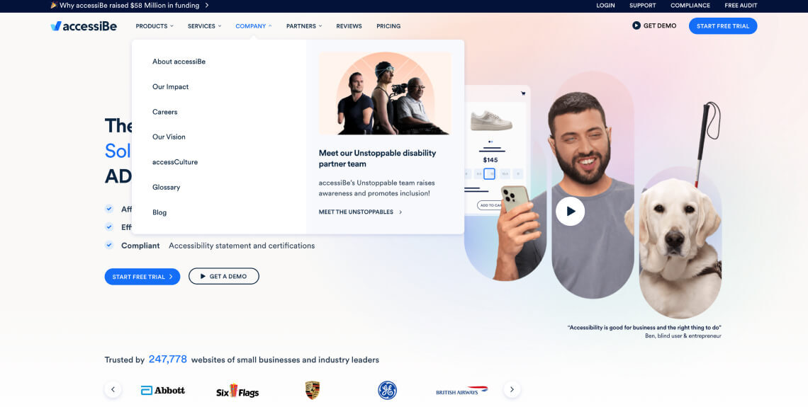
If the COMPANY tab appears as the third tab from the right on the homepage, it needs to appear in that exact spot throughout the entire website. The same applies to the CTAs appearing within the dropdown menu enacted when hovering or clicking on COMPANY.
Allow for content to be increased and decreased in size
Website visitors need to be able to increase and decrease text up to 200% without loss of content or functionality. This is crucial for individuals with vision impairments who may need larger text for better readability. Responsive design principles should be applied to ensure that text remains legible at different zoom levels.
Try to avoid auto-replaying media
Automatic media, such as autoplaying videos or slideshows, can be disruptive for some users. Providing controls to stop or pause automatic media ensures that users have the choice to interact with such content. Additionally, any automatic navigation elements should be clearly labeled and easily manageable.
Use simple and clear language
Using plain language involves presenting information in a clear, straightforward manner that is easy to understand. This benefits users with cognitive disabilities, as well as those who may not be proficient in the language used on the website. Avoiding jargon and complex language enhances overall accessibility. You should also ensure that each web page has the correct language assigned to it. This can be determined by the lang attribute on the HTML element.
Include an accessibility statement
Accessibility statements convey a website’s commitment to providing an inclusive user experience. These statements typically include information about the accessibility features of the site, known limitations, and contact details for people with disabilities seeking support. An accessibility statement is typically found on its own dedicated web page or within the accessWidget menu. While not explicitly mandated to conform with WCAG, including such statements fosters transparency and trust, and will help you comply with web accessibility laws that may apply to you, such as Section 508 of the Rehabilitation Act and the Accessibility for Ontarians with Disabilities Act (AODA).
You can press here for an example of an accessibility statement.
Ensure your website does not feature content that can induce seizures
Content such as fast-strobing lights can induce seizures. Even if you trigger warnings for such content, website visitors can easily miss them, and they are therefore an insufficient measure. Instead, avoid designing content in a way that is known to cause seizures. Your websites shouldn’t contain any content that flashes more than three times in one second.
Make sure your online documents are accessible, as well
Ensuring that your website is accessible extends beyond the web pages themselves to include any online documents you provide. Online documents, such as PDFs, are commonly used for sharing information like user manuals or guides. To make these documents accessible, consider implementing the following practices:
- Accurately add tags to PDFs: When creating PDFs, use proper tags to define the structure of the document. This allows screen readers to interpret and convey the content more accurately
- Add alt text for meaningful images: Just as you would for images on your website, include alternative text for images within PDFs. This ensures that users relying on screen readers can understand the information conveyed through images
- Apply proper heading structures: Maintain a clear heading hierarchy within the document. Headings help users navigate and understand the structure of the content, especially when using screen readers
- Use proper color contrasts: Ensure that color contrasts within documents are sufficient for readability. This is crucial for users with visual impairments who may rely on high contrast for better visibility
It is worth noting that remediating online documents can prove challenging. This is especially true when dealing with a high volume of documents, and in regards to those that are more complex in nature. Many website owners choose to rely on web accessibility experts, like accessServices, to remediate their online documents for them. With an intimate knowledge of WCAG and its applications to online documents, these experts are better equipped to handle these tasks in a timely and cost-effective manner.
Regularly update and maintain accessibility features
Accessibility is an ever-changing landscape. Regular monitoring and updates are necessary to address emerging challenges, incorporate improvements in technology, and to stay conformant with WCAG.. It is critical you stay mindful of accessibility whenever you introduce new elements to your website. These include adding videos, redesigning certain graphic elements, and introducing new online documents.
A deeper look at WCAG
Despite it being a long and fairly complex document, WCAG, at its core, is based on four guiding principles:
- Perceivable: Website visitors should be able to perceive content appearing on your website through their senses of sight, sound, and touch. To that end, alt text should be added to meaningful images, and captions should be added to videos, among other measures
- Operable: Website visitors need to be able to operate a website regardless of ability. In more practical terms, an operable website is navigable entirely by keyboard, sight-assisted navigation, and other alternatives to a classic mouse
- Understandable: A website needs to be easy to understand. To that end, its layout should be simple and predictable, menus and other repeated components should appear consistently throughout the entire website, and the default language of a given web page must be set
- Robust: There are two factors for a robust site: Using clean HTML and CSS code that meets recognized standards and being compatible with assistive tools that people with disabilities use to browse online
WCAG versions and conformance levels
WCAG has evolved over the years to keep pace with changing technologies and user needs. Currently, there are three main WCAG versions:
- WCAG 2.0
- WCAG 2.1
- WCAG 2.2
Each version introduces new success criteria and recommendations to improve web accessibility. It’s important to note that the most recent version, WCAG 2.2, which was released on October 5, 2023, builds upon WCAG 2.1, making it the most up-to-date standard.
WCAG defines three conformance levels:
- Level A – the lowest level of conformance
- Level AA – the conformance level referenced in most accessibility regulations around the world
- Level AAA – the optimal and most difficult level of conformance to achieve
Each conformance level consists of success criteria that websites need to meet to reach WCAG conformance at the desired level. These criteria address various aspects of web accessibility, including text alternatives, keyboard operability, color contrast, and many more.
As a general rule, achieving accessibility entails conforming to WCAG 2.1 or 2.2 at Level AA.
It is important to note that websites that need to comply with Section 508 of the Rehabilitation Act or the Accessibility for Ontarians with Disabilities Act (AODA) must conform to the earlier version of WCAG, WCAG 2.0, at an AA level.
Additionally, under the Americans with Disabilities Act (ADA), many U.S courts reference WCAG 2.0 and 2.1 at Level AA as the standard websites should conform to under the law.
Can you rely on built-in features to achieve website accessibility?
While many website-building platforms claim to offer built-in features for achieving accessibility, it’s important to recognize that these tools may not cover all aspects of accessibility or fully comply with updated standards. CMSs like WordPress (including Elementor and Divi), along with site-building platforms like Shopify, Squarespace, and Webflow do provide some accessibility features.
However, all major CMSs have accessibility issues that cannot be properly addressed when relying on these platforms’ built-in solutions and offerings.
If you plan on relying on them, you will not reach conformance with WCAG 2.0 or 2.1 at Level AA.
It is therefore highly recommended to integrate with web accessibility solutions, like accessWidget. Seamlessly integrating with the leading CMSs and website building platforms, accessWidget automatically scans your website’s code, flagging problematic areas. Then, it remediates the inaccessible code (for example, by adding the proper ARIA attributes to dynamic elements).
Additionally, accessWidget presents website visitors with an interface through which they can adjust design elements to fit their individual abilities. With the interface, website visitors with disabilities can adjust font sizes and types, select different color contrasts, halt animations, and enable a read-only mode.
How can you test your website’s current accessibility status?
There are are a number of options for assessing your website’s current level of accessibility:
You can rely on web accessibility experts, like accessServices, to conduct manual assessments of your website. Experts can provide valuable insights and recommendations for improvement. Additionally, when approached correctly, experts will involve people with disabilities in the testing process. accessServices, for example, incorporates user testing conducted by people with various disabilities and impairments that provide valuable insights pertaining to their unique needs.
You can also use automated tools like accessScan to efficiently scan your website for potential accessibility issues. With accessScan, all you have to do is submit your website’s URL, after which it will perform a quick, automated audit of it. Within seconds, you’ll be given a score: Accessible or non-compliant. You will also be given a detailed account of the accessibility issues found throughout the testing process (if any exist).
It is highly advisable to incorporate both testing methods. Automated tools will quickly and efficiently identify most accessibility issues, after which experts can further investigate and understand their true scope.
The importance of ensuring your website is fully accessible
People with disabilities deserve equal access to online environments. It is on us, as website owners, to ensure that members of the various disability communities (which more than a quarter of adult Americans belong to) are extended the same opportunities to browse and enjoy our websites.
It is worth noting that members of the various disability communities (along with their family members) have immense spending power, commanding more than $13 trillion in expendable income. By making your website accessible to individuals with disabilities, and treating them with the respect they deserve, you allow them to browse your offerings and potentially become a paying customer.
Potential legal obligations
Businesses operating in the United States, Canada, or the European Union may be legally obligated to ensure their websites are accessible.
In the U.S., many courts consider the Americans with Disabilities Act (ADA) as applicable to online spaces, often referencing WCAG as the necessary standard for web accessibility. Most public-facing businesses must therefore ensure their sites are accessible under the ADA. Further details on this can be found in our ADA website compliance checklist.
Government entities, federally-funded organizations, and those providing services to such groups need to comply with Section 508 of the Rehabilitation Act. Under this law, websites (along with other information and communication technology products) conform to WCAG 2.0 Level AA standards. Further information is available in our Section 508 website compliance checklist.
The vast majority of businesses registered in Ontario, Canada, need to comply with the Accessibility for Ontarians with Disabilities Act (AODA). Under this law, your website needs to conform to WCAG 2.0 Level AA. Our AODA website compliance checklist offers more insights into these requirements.
Frequently asked questions about how to make your website accessible
Q1. What does it mean for a website to be accessible?
A1. It means the site can be used by all people, including those with disabilities. This includes ensuring compatibility with assistive technologies, operability via keyboard alone, meaningful alt text for images, readable contrast, clear navigation, and logical structure.
Q2. Which standard guides website accessibility efforts?
A2. Most organizations target the Web Content Accessibility Guidelines (WCAG) 2.1 Level AA as the benchmark. Although the ADA doesn’t cite it explicitly, WCAG 2.1 Level AA is widely treated as the standard for demonstrating accessible digital content.
Q3. What are key action-items for making a website accessible?
A3. Some fundamental steps include: enabling keyboard-only navigation; ensuring screen-reader compatibility; adding alt text for meaningful images; using sufficient color contrast; providing captions or transcripts for videos; structuring content with proper headings; avoiding motion that causes seizures; and ensuring online documents are accessible.
Q4. Does built-in website platform functionality guarantee accessibility?
A4. No. While modern platforms often include accessibility-friendly features, achieving full accessibility requires deliberate action: manual and automated audits, remediation of underlying code, and continuous monitoring—not just relying on defaults.
Q5. How should a website owner test their site for accessibility?
A5. Use a mix of automated scanning tools and manual testing with assistive technologies (e.g., screen readers, keyboard navigation). Check key elements like form labels, alt text, contrast ratios, reading order, media captions, and responsive behavior. Document findings and update as content or features change.
Q6. How can accessiBe help make your website accessible?
A6. accessiBe helps businesses achieve and maintain accessibility through a full ecosystem of AI-powered tools and expert services. Its solutions include automated scanning, AI-driven remediation, manual audits, a native accessibility management platform, litigation support, and accessibility documentation—all designed to align websites with WCAG 2.1 or 2.2 Level AA standards and support ongoing ADA compliance.
Closing thoughts
Making your website accessible is not only a legal requirement but also an ethical responsibility. By adhering to the Web Content Accessibility Guidelines (WCAG) 2.1, Level AA, you ensure that your website provides an inclusive browsing experience for all users, including those with disabilities. With the right tools, ensuring your website can be enjoyed and accessed by all visitors is within reach.

