Dyslexia affects millions of people worldwide, yet its impact on digital reading experiences often goes unnoticed. Roughly 15–20% of the global population may have dyslexia, making it one of the most common learning disabilities.
When typography and layout choices don’t account for dyslexic readers, many users struggle to navigate content comfortably, retain information, or complete important tasks online.
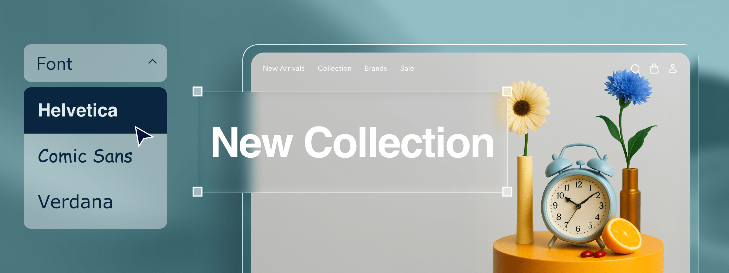
Choosing dyslexia-friendly fonts—and supporting those choices with accessibility-aligned design—helps create a more inclusive reading experience.
While typography alone doesn’t achieve full accessibility, it significantly improves readability, supports comprehension, and sets the foundation for a digital experience that accommodates users with a range of abilities.
This article explores:
- How dyslexia affects reading
- The most recognized dyslexia-friendly fonts
- Where to find specialized typefaces
- WCAG-aligned design practices that support clearer reading
Understanding dyslexia and how it affects reading
Dyslexia is a language-based neurological difference that affects how individuals read, write, decode, and interpret written text. It is not connected to intelligence—rather, it reflects how the brain processes language.
Common reading challenges for dyslexic users
People with dyslexia may experience:
- Letter reversals or mirroring
- Difficulty tracking lines
- Visual “crowding,” where letters appear to blend
- Challenges with narrow spacing
- Fatigue from dense paragraphs or overly stylized fonts
On a website, typography and layout can either ease these challenges or amplify them. This is why font choice, spacing, and structure are essential parts of inclusive design.
How dyslexia is addressed by the Web Content Accessibility Guidelines
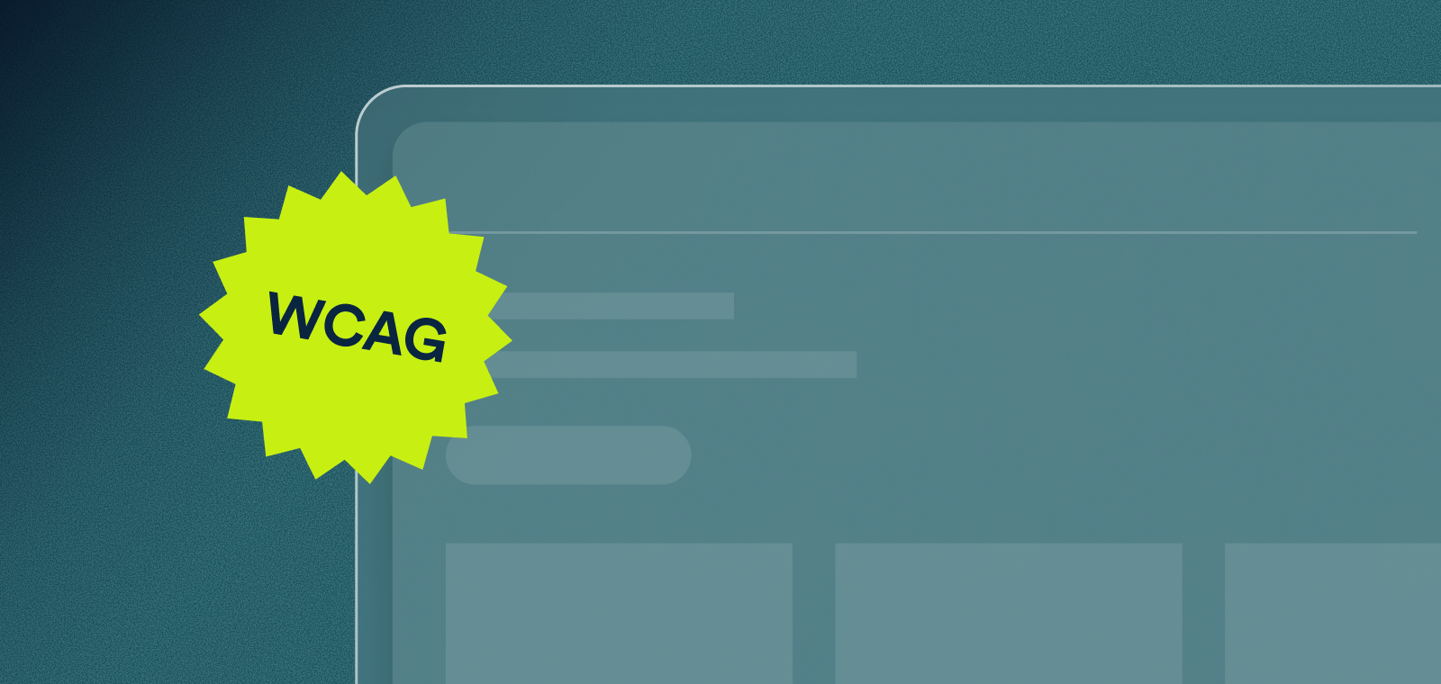
Before exploring specific font and design strategies, it’s important to understand how dyslexia fits into the broader landscape of digital accessibility standards.
The Web Content Accessibility Guidelines (WCAG) are a globally recognized set of technical guidelines published by the World Wide Web Consortium (W3C). They outline how digital content should be designed so that it is perceivable, operable, understandable, and robust for people with disabilities—including individuals with dyslexia and other cognitive or learning differences.
Although WCAG is not a law, it plays a key role in shaping accessibility expectations:
- Government bodies and regulators frequently reference WCAG when assessing digital accessibility
- U.S. courts often reference WCAG 2.1 Level AA as the guiding document for evaluating accessibility in cases involving the Americans with Disabilities Act (ADA), even though WCAG itself is not a law
- Many global accessibility regulations adopt WCAG directly as their technical standard (such as Section 508, EN 301 549, and Canada’s AODA).
To learn more about WCAG, its versions, and its levels of conformance, we recommend you check out the following articles:
- What is WCAG?
- The ultimate guide to WCAG
- The ultimate WCAG 2.1 and 2.2 Level AA checklist
- What you need to know about WCAG 2.2
How WCAG supports dyslexic people
WCAG includes several guidelines that directly improve readability, reduce cognitive load, and support dyslexic users. While these criteria aren’t dyslexia-specific, they help create text environments that are easier to process, more consistent, and more predictable — all of which are essential for readers with cognitive or learning differences.
1.4.12 Text spacing
This guideline ensures users can increase line, letter, and paragraph spacing without breaking the layout. Adequate spacing reduces visual crowding and makes letters easier to distinguish — a key need for many dyslexic readers.
1.4.3 Contrast (Minimum)
High contrast between text and background helps users differentiate characters more easily. Low contrast can cause letters to blur or fade together, which is especially challenging for people who already struggle with letter recognition.
1.4.4 Resize text
This guideline supports readability by ensuring users can enlarge text without losing content or functionality. Larger text helps dyslexic readers identify letter shapes more clearly and reduces eye strain.
1.3.1 Info and relationships
WCAG requires content to be structured properly using headings, lists, and semantic markup. Clear structure helps dyslexic readers understand content hierarchy and navigate pages more predictably, reducing cognitive effort.
1.4.1 Use of color
This criterion ensures that color alone isn’t used to convey meaning. Dyslexic readers may miss cues when color is the only indicator, so requiring additional visual or textual information supports better comprehension.
3.1.5 Reading level
WCAG encourages content to be written in clear, straightforward language when possible. Plain-language writing reduces cognitive load and helps dyslexic readers process information more efficiently.
Together, these guidelines create a more inclusive reading environment by supporting readability, clarity, and comprehension.
And while WCAG does not mandate the use of dyslexia-specific fonts, it provides a strong accessibility framework that benefits dyslexic users as part of a broader effort to support cognitive and learning accessibility.
Popular dyslexia-friendly fonts
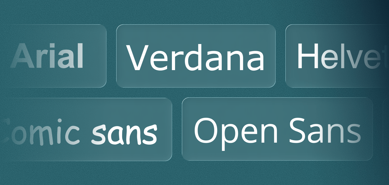
Many commonly used fonts already support readability for dyslexic users. These include:
- Arial
- Tahoma
- Verdana
- Trebuchet
- Helvetica
- Open Sans
- Century Gothic
- Calibri
- Comic Sans (while stylistically polarizing, its distinct shapes support readability for many dyslexic readers)
- Inter
- Roboto
- Lato
- Nunito
- Nunito Sans
- Source Sans Pro
- Atkinson Hyperlegible
- Ubuntu
- PT Sans
What makes these typefaces more readable?
These typefaces share characteristics that enhance readability: open shapes, minimal ornamentation, and clear distinctions between letters.
Fonts that support clearer reading—especially for people with dyslexia—tend to share several design characteristics that make letter shapes easier to recognize and reduce visual crowding. These features also improve readability for many other users, including those with low vision or cognitive differences.
Open apertures
Letters with wider openings (like c, e, a, and s) are easier to distinguish from one another, reducing the likelihood of characters blending together.
Consistent stroke widths
When a font avoids dramatic thicks and thins, the result is a cleaner, more predictable letterform. This helps reduce visual noise and supports quicker character recognition.
Larger x-heights
Fonts where the main body of each lowercase letter is relatively tall improve legibility, especially at smaller sizes. A generous x-height makes words feel more spacious and easier to scan.
Minimal ornamentation
Fonts with simple, unobstructed shapes—rather than decorative serifs or extra flourishes—help reduce cognitive load and prevent letters from appearing overly complex.
Together, these qualities contribute to clearer text, smoother eye tracking, and a more comfortable reading experience, particularly for people who benefit from simplified visual patterns.
Purpose-built dyslexia fonts
Several typefaces were specifically designed to support dyslexic readers. These can be used as alternative reading modes or integrated into accessibility interfaces.
- Dyslexie: Features heavier bottoms, wide openings, and generous spacing
- OpenDyslexic: An open-source font with weighted bottoms and differentiated shapes
- Read Regular: Developed with input from dyslexic users to maximize clarity
- Sylexiad: A research-backed typeface designed in consultation with adult dyslexic readers
These fonts are optional, but offering them as choices within accessibility settings can make reading more comfortable for many users.
Design principles for dyslexic readers
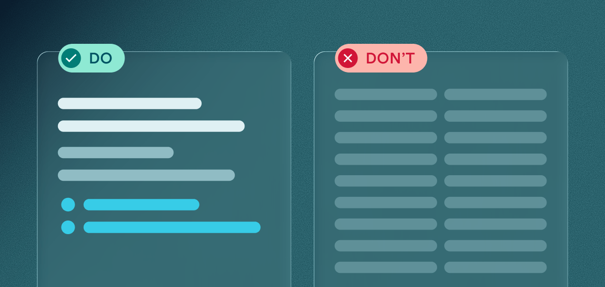
Along with choosing the right fonts, adhering to these design principles can enhance readability for people with dyslexia. These practices help reduce visual strain, support clearer text recognition, and create a reading experience that feels more approachable for everyone.
Choose sans-serif fonts
Sans-serif fonts reduce visual clutter and support clearer character recognition, making it easier for dyslexic readers to distinguish letters.
Use larger font sizes
A minimum of 16px helps ensure that text remains comfortable to read and reduces the effort required to identify letter shapes.
Keep line lengths between 45–100 characters
Shorter line lengths support smoother eye tracking and decrease the likelihood of skipping or rereading lines.
Increase spacing
WCAG recommends spacing levels that prevent crowding and support clearer reading:
- Line height: at least 1.5×
- Letter spacing: at least 0.12em
- Word spacing: at least 0.16em
This additional spacing reduces visual overload and helps readers follow along more comfortably.
Ensure high contrast
WCAG requires a contrast ratio of :
- 4.5:1 for normal text
- 3:1 for large or bold text
Strong color contrast makes text easier to distinguish and supports users who may struggle with letter recognition.
Use left-aligned text
Left alignment provides a consistent starting point for each line, making scanning more predictable for dyslexic readers.
Avoid all caps and excessive italics
These styles can distort the natural shapes of words, increasing cognitive effort and slowing down reading.
Break up large blocks of text
Clear headings, short paragraphs, and scannable formatting help dyslexic readers process information more easily and prevent fatigue.
How using the right accessibility solution can impact visitors with disabilities
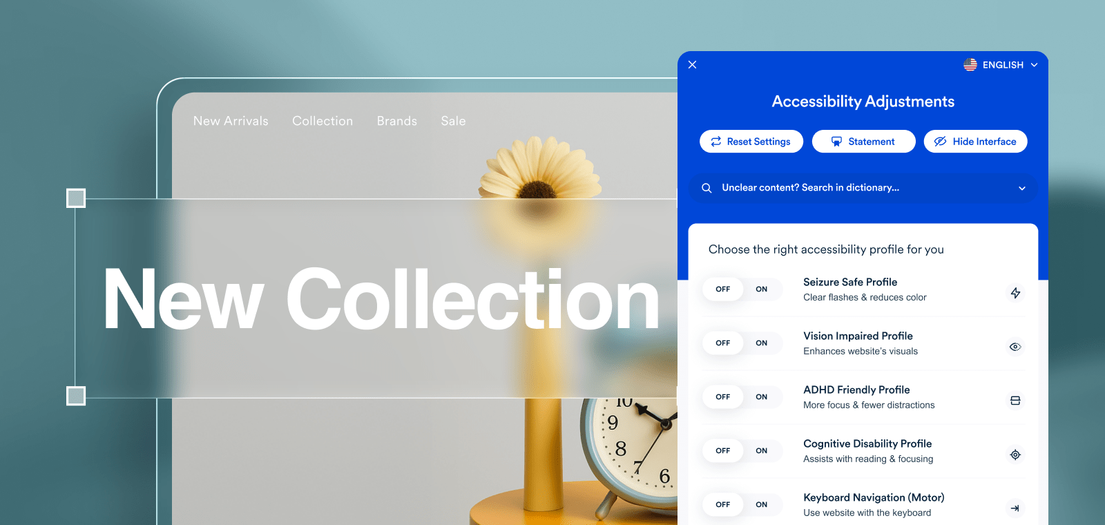
An accessibility solution can make a meaningful difference in how people with disabilities experience your website.
accessWidget—one of accessiBe’s accessibility solutions—is an AI-powered tool that gives website visitors an interface where they can adjust how content appears. These adjustments include changing font styles, increasing spacing, modifying contrast, enlarging text, and activating features that support clearer reading and navigation.
For people with dyslexia, these options can help reduce visual crowding, clarify letter shapes, and make it easier to follow content.
accessWidget was also developed with input from individuals with a wide range of disabilities, so it includes features that support users with low vision, motor impairments, epilepsy, cognitive and learning differences, and those who rely on screen readers. Together, these capabilities help create a browsing experience that is more comfortable and more inclusive for all visitors.
Adjusting your website for more inclusive reading experiences
Designing with dyslexic readers in mind is a meaningful step toward creating a digital environment that welcomes everyone. By choosing readable fonts, following WCAG-aligned design practices, and offering tools that help users personalize how they experience content, you strengthen both accessibility and usability. Thoughtful typography benefits all visitors—and when supported by the right accessibility solutions, it can help more people read, understand, and engage with your website with confidence.
Frequently asked questions about fonts for people with dyslexia
Q1. What makes a font dyslexia-friendly?
A1. Dyslexia-friendly fonts typically use clear letter shapes, wider spacing, and minimal ornamentation. These features help reduce visual confusion, support letter recognition, and make reading more comfortable for many dyslexic users.
Q2. Are dyslexia-specific fonts required for accessibility?
A2. No. WCAG does not require dyslexia-specific fonts. However, offering simple, readable sans-serif options can help improve clarity and support a more inclusive reading experience.
Q3. Do dyslexia-friendly fonts help everyone?
A3. Yes. Fonts that are easier to read benefit dyslexic users and also improve clarity and reduce strain for many other readers, including those with low vision or cognitive differences.
Q4. How does WCAG relate to dyslexia?
A4. WCAG does not directly mandate dyslexia-specific design, but several guidelines—such as spacing, contrast, structure, and readability—improve how people with dyslexia process and understand content.
Q5. Can accessWidget improve readability for dyslexic users?
A5. Yes. accessWidget offers readable font options, adjustable spacing, contrast settings, and focus tools that help dyslexic users personalize the reading experience and reduce cognitive load.
Q6. What else can I do to support dyslexic readers on my website?
A6. Using left-aligned text, increasing spacing, shortening paragraphs, ensuring strong contrast, and reducing visual clutter all help improve readability. Allowing users to adjust these settings—such as through accessWidget—provides even more flexibility and support.